Just want to see the work? , only the screens and mockups with their captions. Totally optional.
A case study by Hernando Saieh Diago
A book club that travels the world one book at a time, and a site designed to grow with it.
The site is in Spanish.
Act 1 of 8
Overview
Baqreads is a book club whose readings are pinned to a hand-drawn world map, and what began as a map grew into a small product, because each stage made the next real need visible.
Baqreads is a book club whose readings are pinned to a hand-drawn world map, one country per book. I designed and built the public site, the visual system behind it, a members-only reviews platform and a page builder that lets the club’s owner change the site on her own, from the first idea to production.
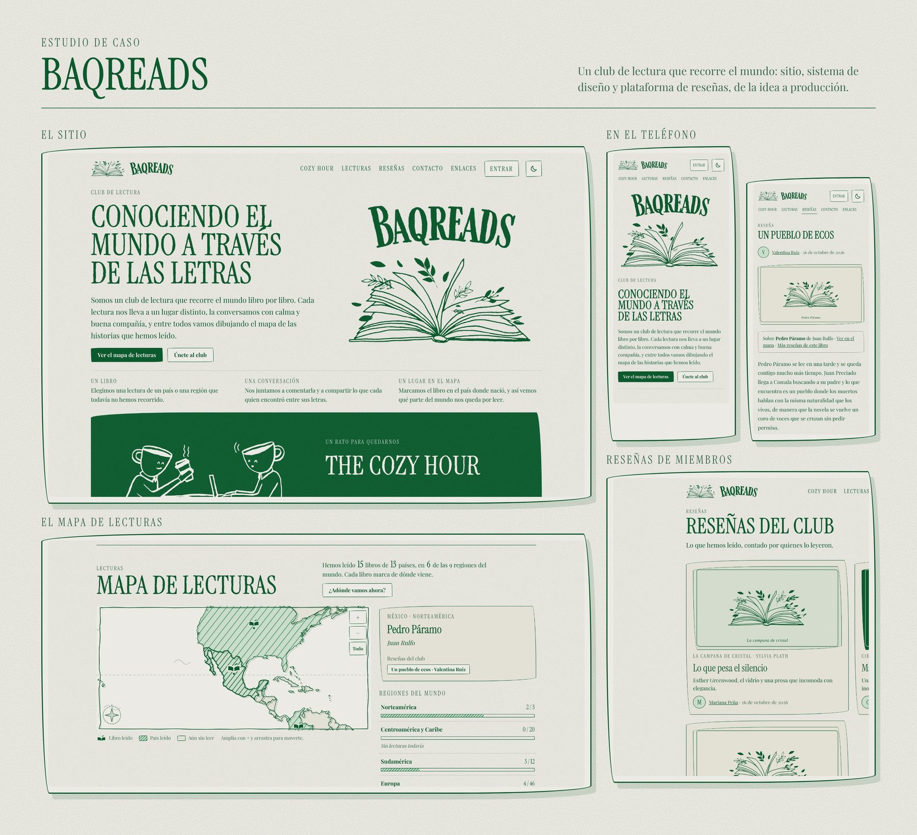
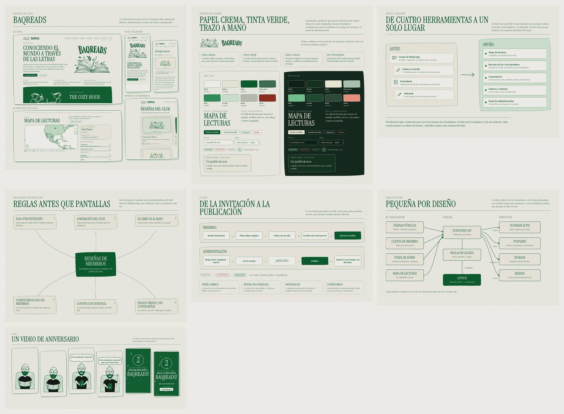
The project started as a map and ended up as a small product, which is the interesting part of the story, because each stage appeared when the previous one made a real need visible. The product itself is in Spanish, so the screens in this case study stay in Spanish and the captions describe them.
- Product design
- UX & UI
- Design system
- Reviews platform
- Page builder
Act 2 of 8
Four tools, one place
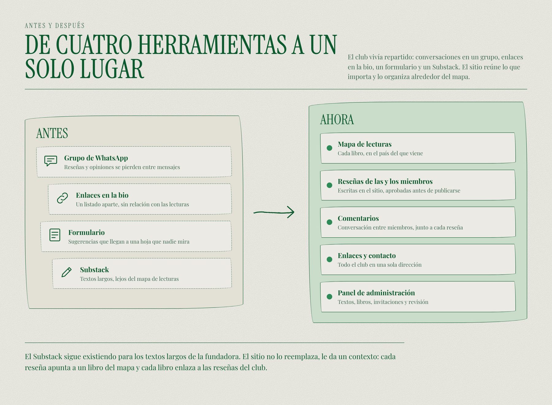
The club lived in a WhatsApp group, a link in the bio, a suggestions form and a Substack, so reviews got lost between messages, and the question became how a small, non-technical club could keep one living home on the web.
The club lived in four places at once: a WhatsApp group for conversation, a link in the bio for everything else, a form for suggestions that landed in a spreadsheet nobody opened, and a Substack for the founder’s long texts. Reviews and opinions got lost between messages, and nothing connected a book to what people had said about it.
The problem
How might a small, non-technical club keep a living, beautiful home on the web, one where every book has a place, members can write about it, and the owner can change things at midnight without asking a developer?
Three constraints shaped every decision that followed.
- It has to feel like paper, not software. The club is about slow reading, so the interface should be calm, warm and a little handmade.
- It has to be cheap and simple to run. I kept it to a handful of managed services with no build pipeline and no server to maintain, so a volunteer never has to babysit it.
- The owner has to stay in control. She edits content herself, sees a preview before anything goes live and can undo a mistake.
Act 3 of 8
A design language of paper and ink
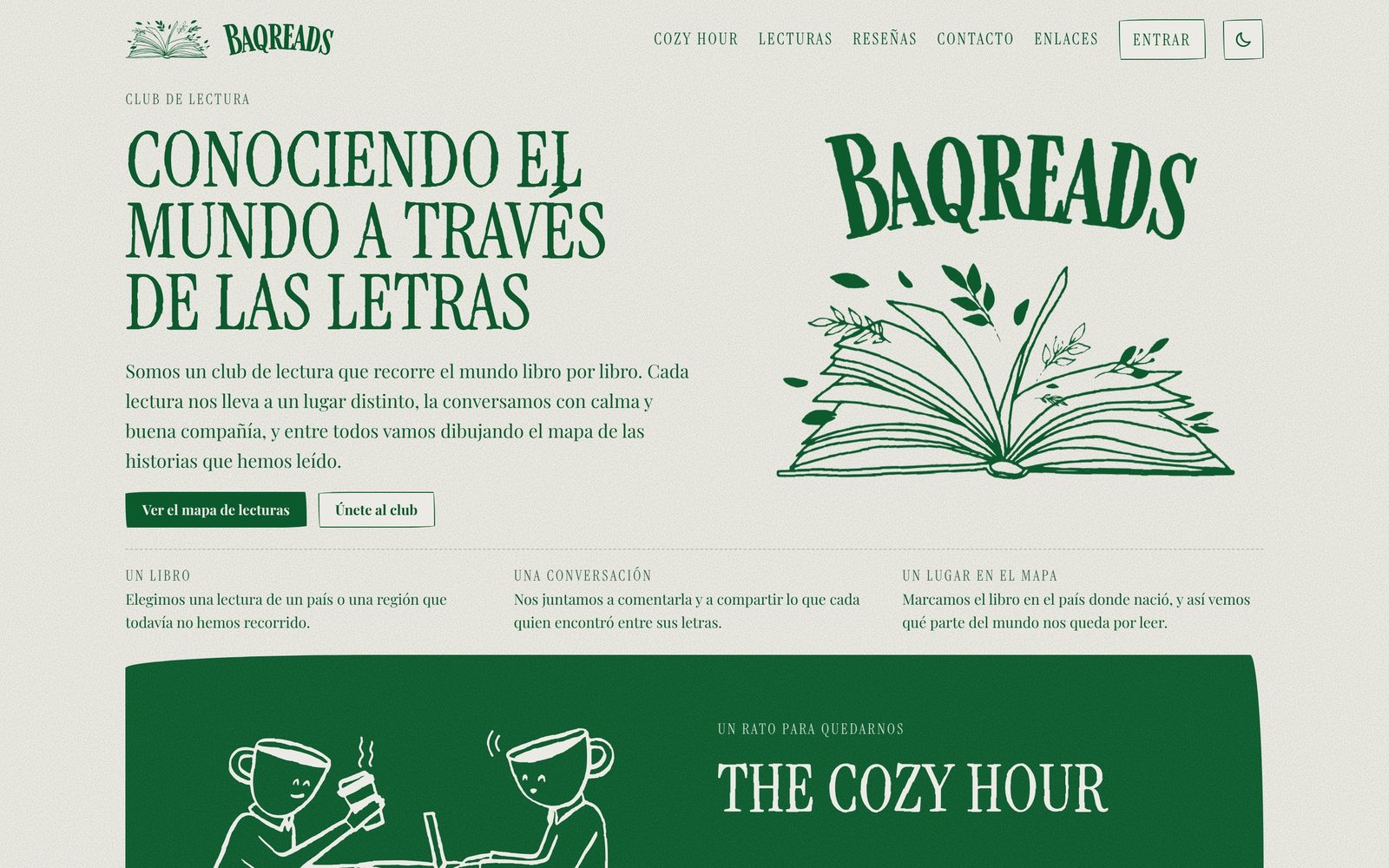
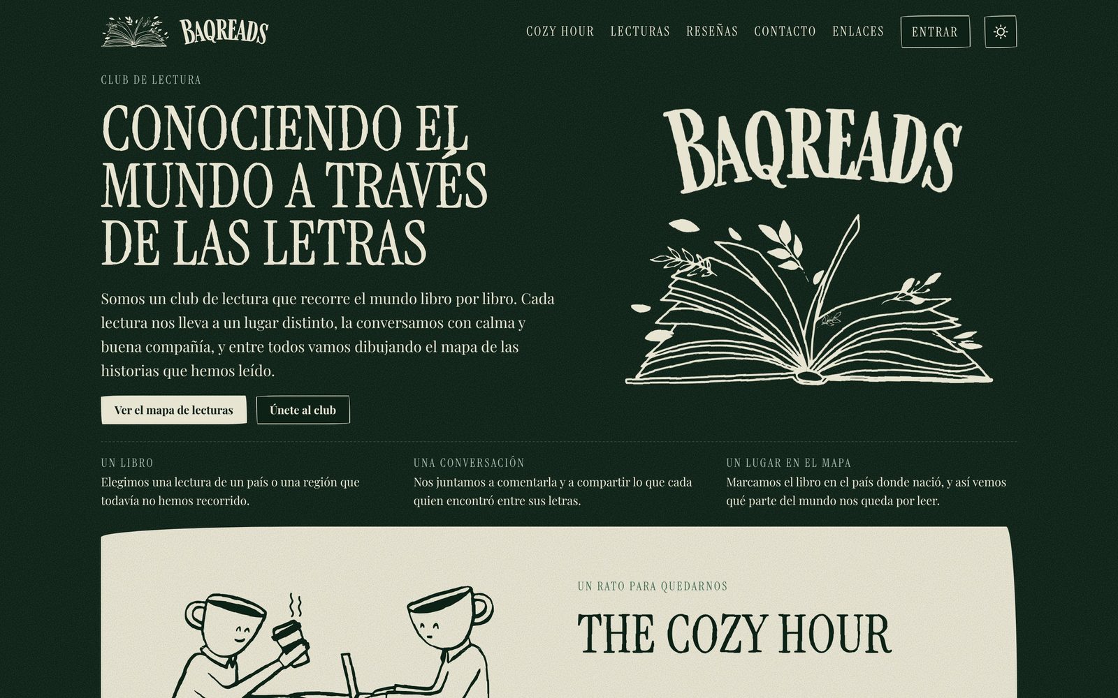
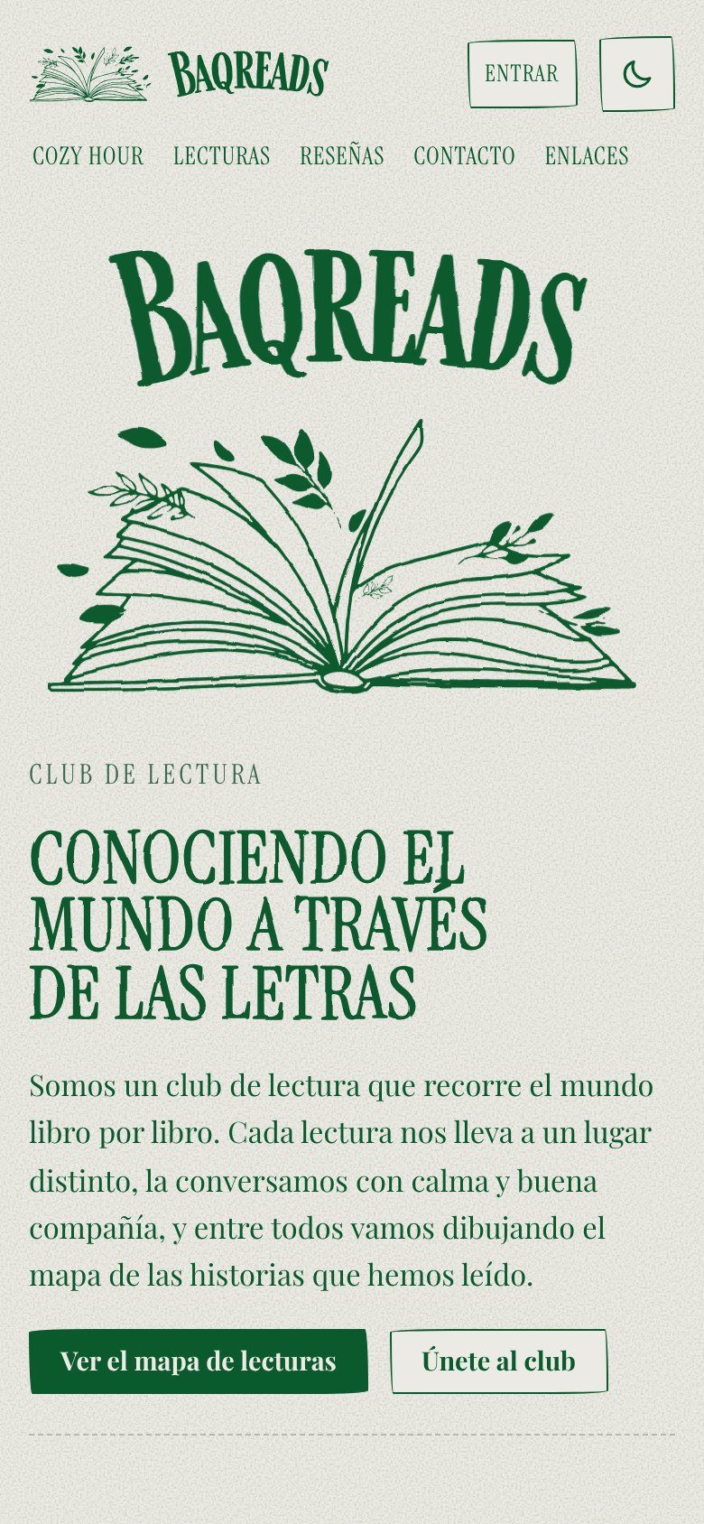
I turned a hand-drawn open book, a deep forest green and a cream paper with grain into a small system that every screen reuses, in light and dark, so the whole site feels like paper instead of software.
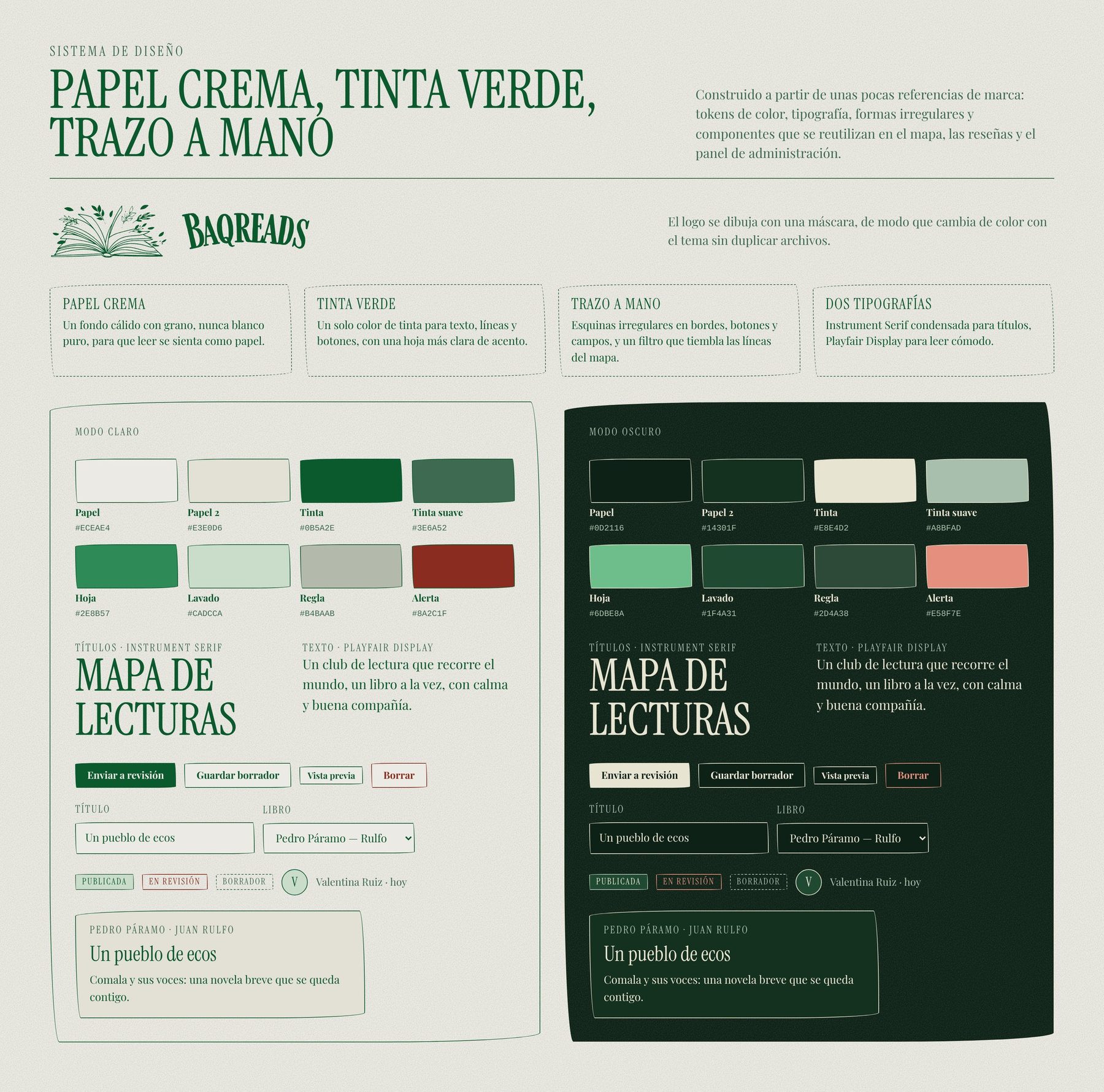
The visual identity comes from a few brand references: a hand-drawn open book, a deep forest green and a cream paper with grain. I turned them into a small system that every screen reuses, including the admin.
- Cream paper and green ink. A warm paper background with grain, one ink color for text, lines and buttons, and a lighter leaf green as the accent.
- Hand-drawn strokes. Irregular corners on borders, buttons and fields, and a subtle displacement filter that makes the lines on the map tremble like pen.
- Two typefaces. A condensed serif for titles and a readable serif for long text.
- Light and dark themes. Both are defined as tokens, so the logo (drawn as a mask) and every component change color without duplicated assets.
Act 4 of 8
The map
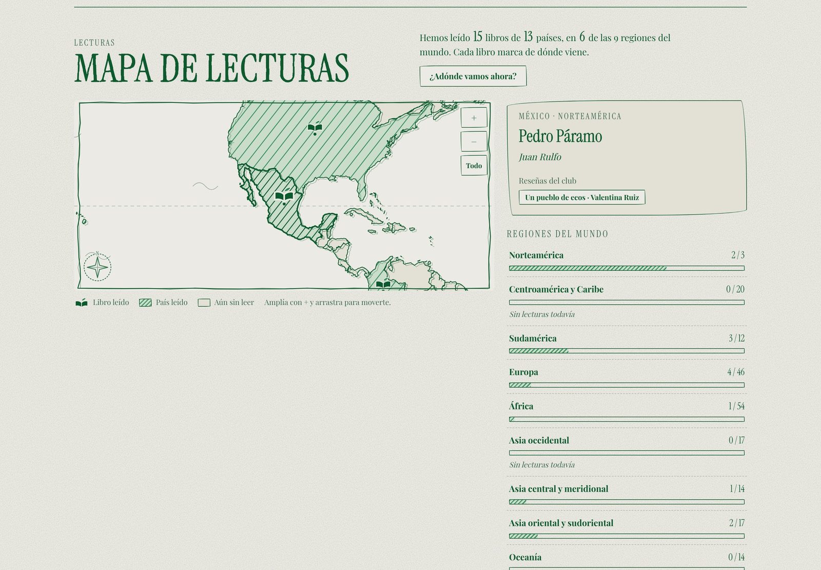
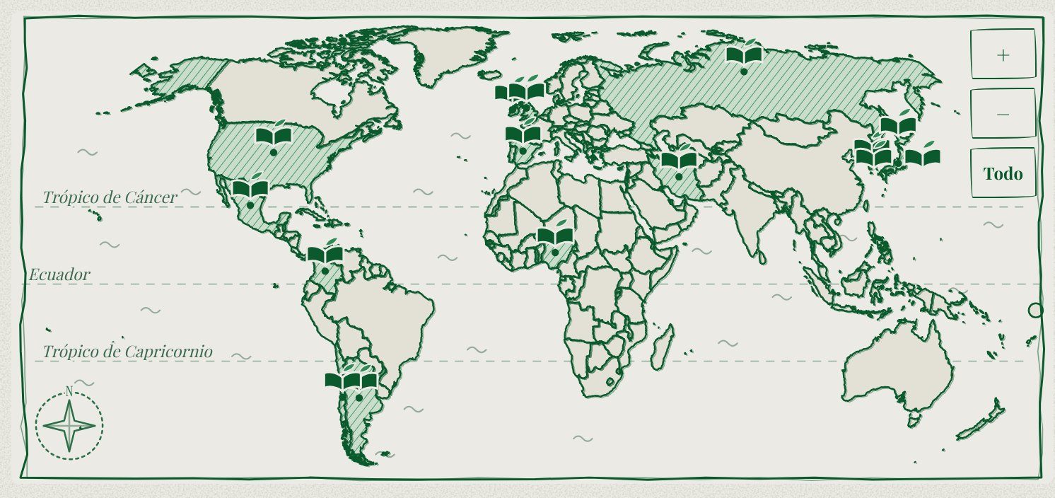
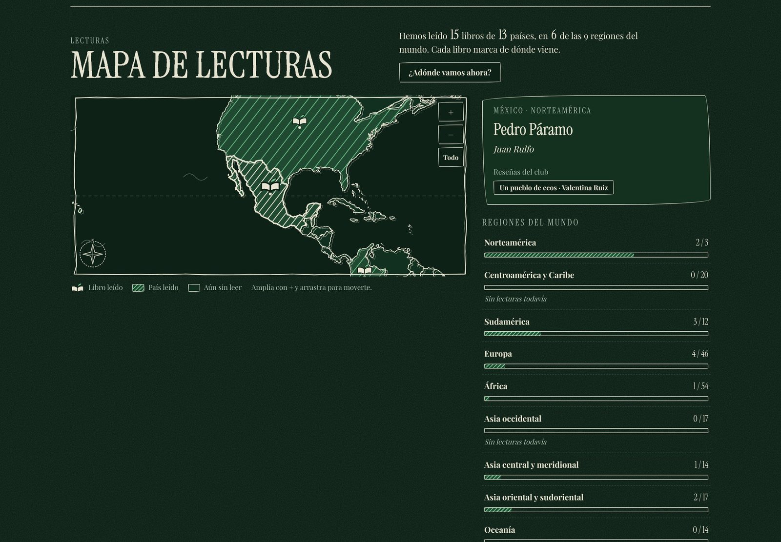
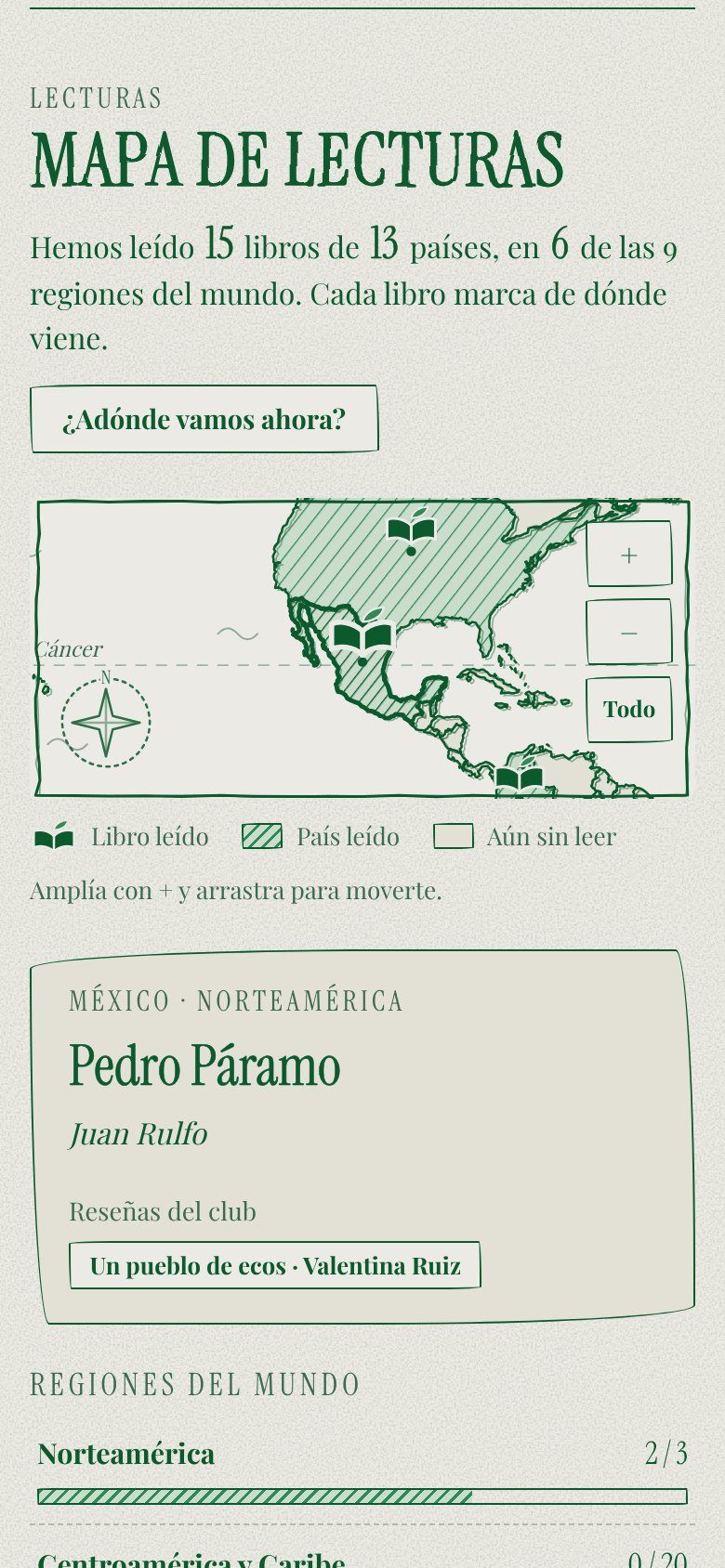
Every book is a pin on the country it comes from, regions fill with hatching as the club reads more, and a pin opens a card with the cover, the author and the club's reviews, on a keyboard, on touch and on a phone.
The map is the heart of the product. Every book is a pin placed on the country it comes from, regions fill with hatching as the club reads more, and a book opens in a card with its cover, author and the club’s reviews. It works with touch, with a keyboard and on a phone, where the map becomes a scrollable, zoomable surface.
Act 5 of 8
Decisions that shaped the product
Constraints did most of the designing, with no framework, a draft and publish flow with a live preview, conflict protection and a Spanish-first voice, all kept deliberately small so a volunteer never has to babysit it.
A few decisions set the shape of the product, each with the reason behind it.
- No framework and no build step. The site is a single HTML file rendered by JavaScript, with the data in a JSON file. For a site this size that means instant deploys, nothing in the tooling to break and code a future maintainer can read in an afternoon.
- Draft and publish, with a live preview. The editor shows the real site in a frame and updates it as you type, but nothing reaches visitors until you press Publish, which gives the owner room to experiment without fear.
- Conflict protection. If two people edit at once, the second save is refused with a clear message instead of silently overwriting the first.
- Spanish first. All labels, errors and emails are written for the club’s own voice instead of being translated afterwards.
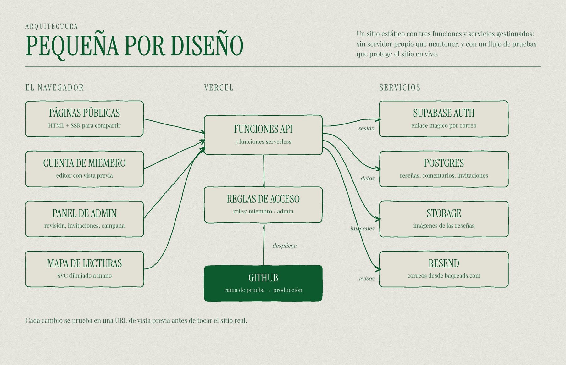
Small by design
The architecture follows the same idea. The site is a static front end, a few serverless functions, storage for content and images, and managed services for authentication and email. The public pages read a cached JSON file, the admin writes to it through a password-protected endpoint, and the reviews platform adds authentication, a database and transactional email on its own branch, so it can launch without touching the live site.
Act 6 of 8
A members-only reviews platform
Once the map was live the club wanted to write about the books, so I designed a members-only platform where reviews are drafted, approved by the owner and then published, with the owner always having the final word.
Once the map was live, the club wanted to write about the books, so I designed a members-only reviews platform on top of the same site. Before drawing any screen I agreed six rules with the club’s administrator, because rules decide what gets built and what does not.
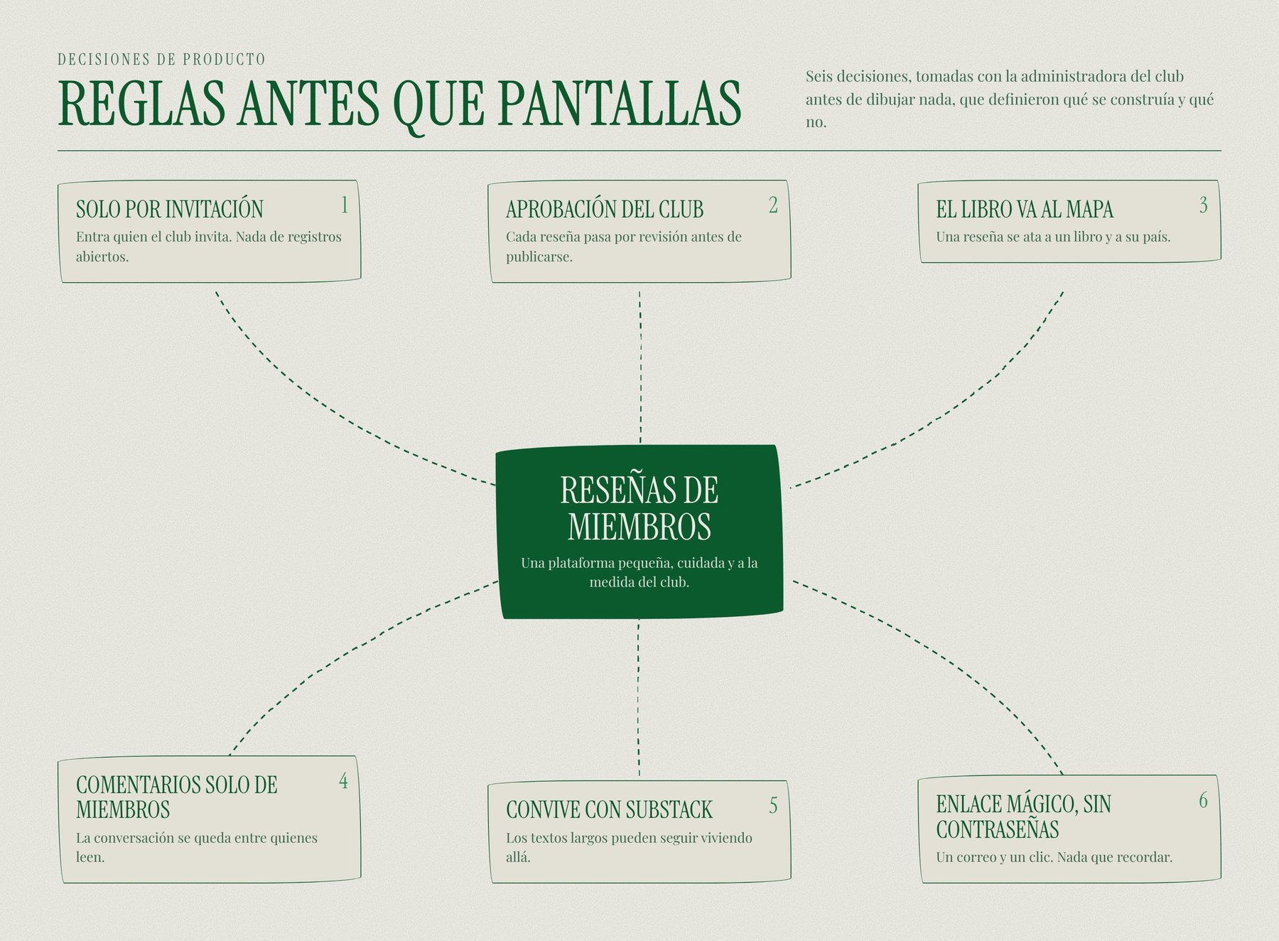
What each side can do
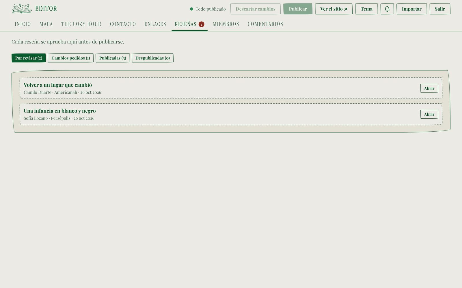
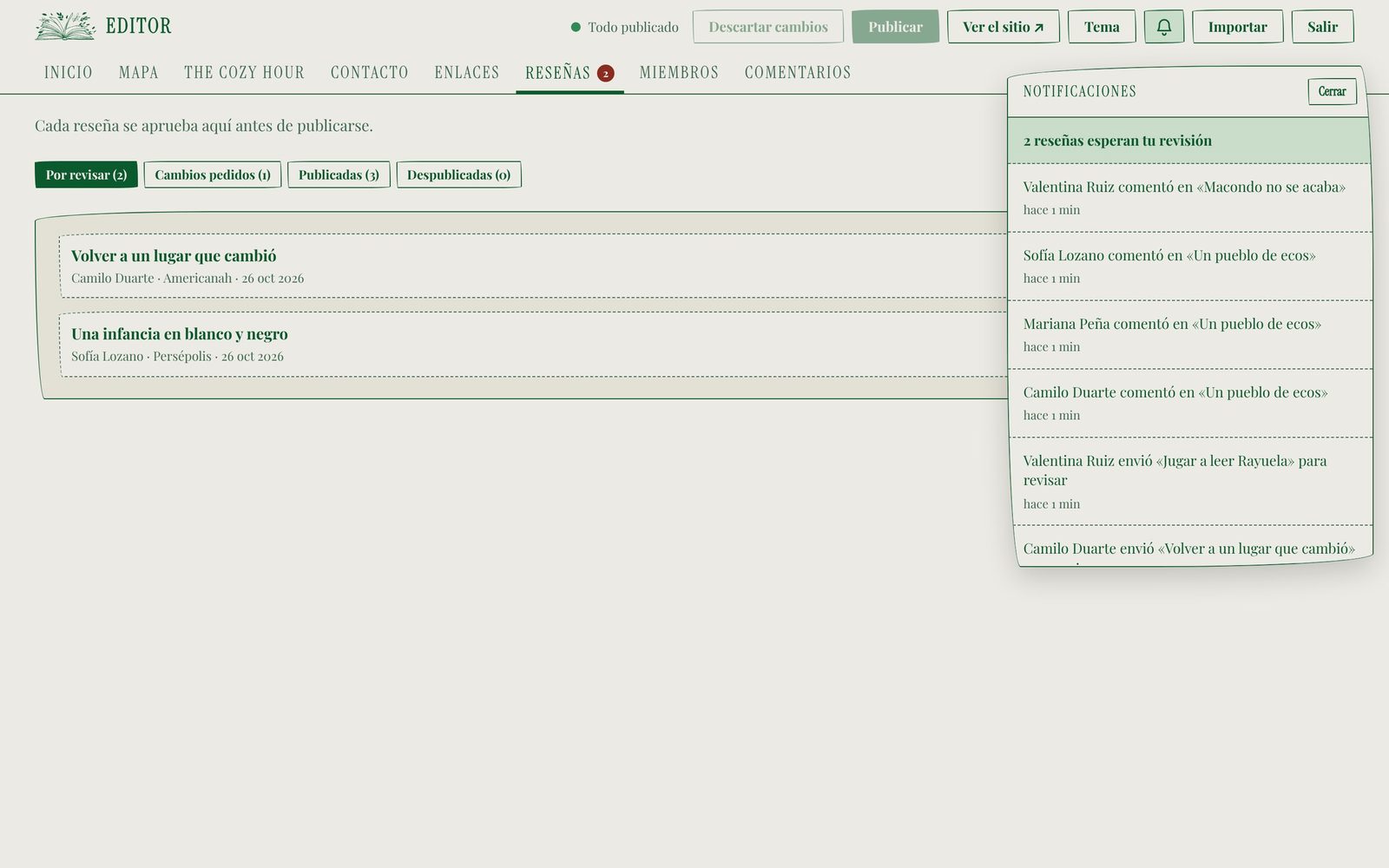
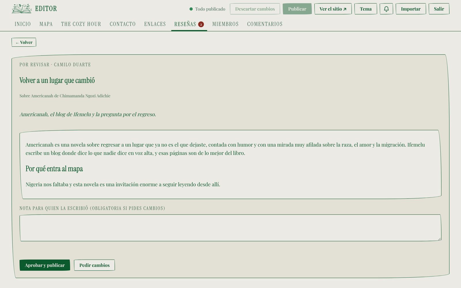
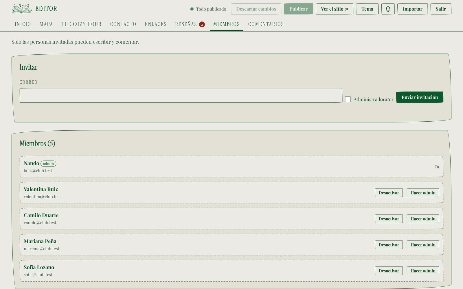
Members sign in by invitation, write a review in an editor with a live preview, send it for approval, follow the status of their own reviews and comment on others’ reviews once they are published. The owner sees a queue of reviews waiting for approval, reads each one, approves it or requests changes with a note, gets notified through a bell and by email, and manages the members.
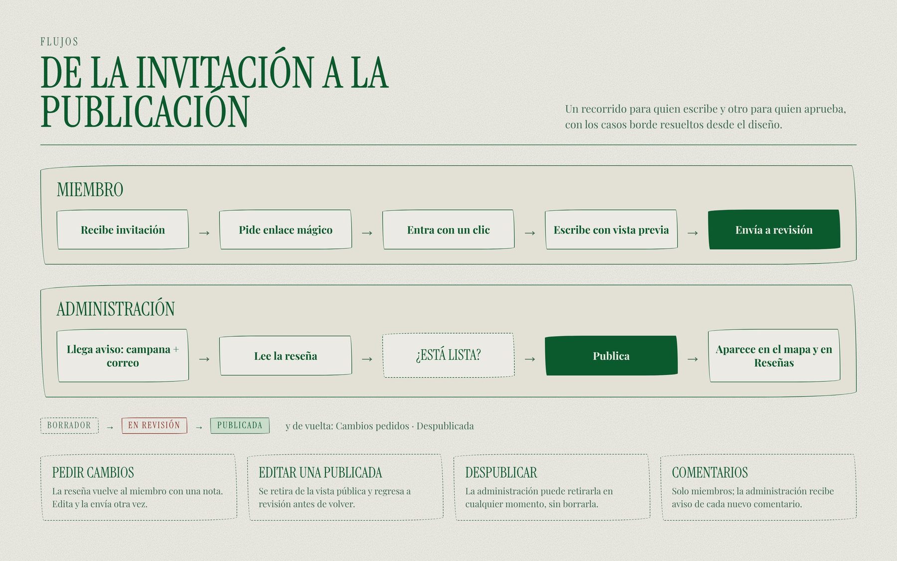
Writing
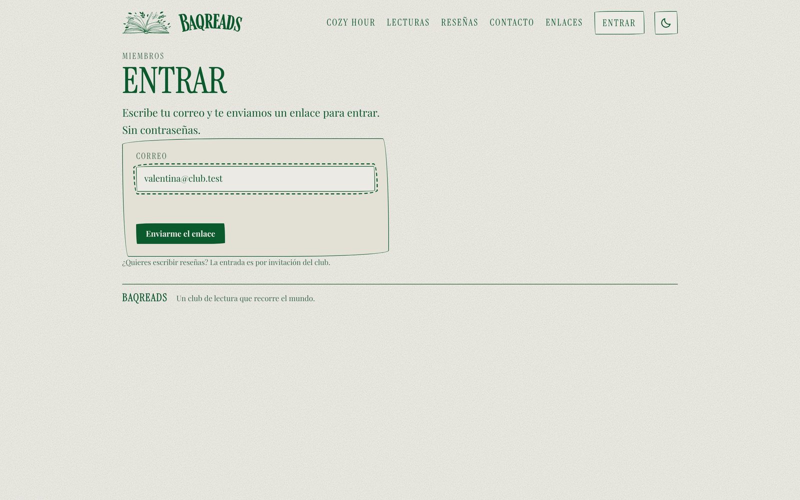
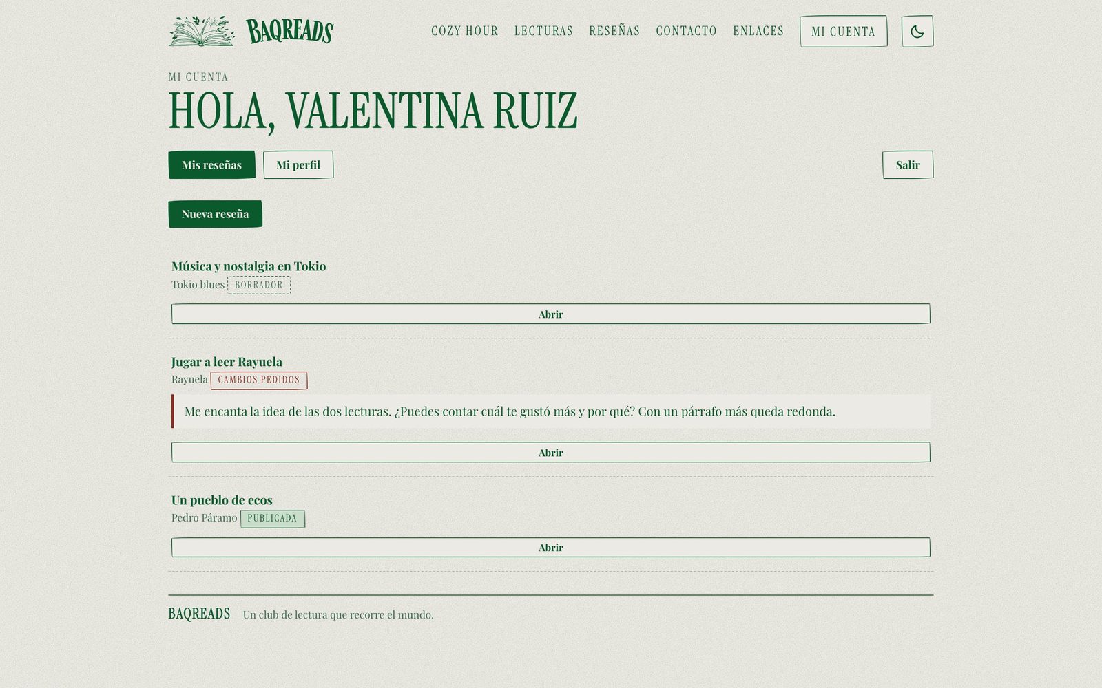
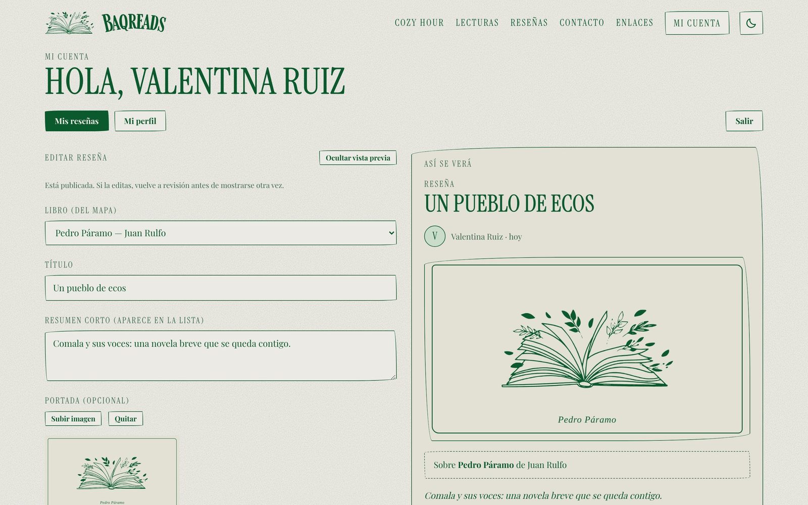
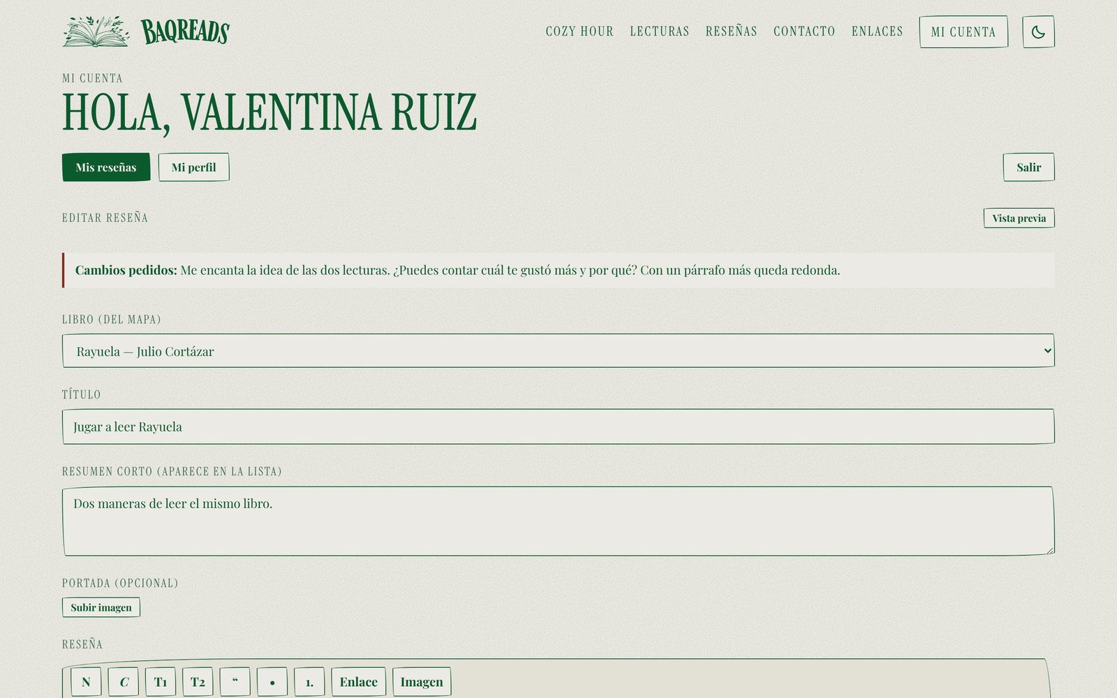
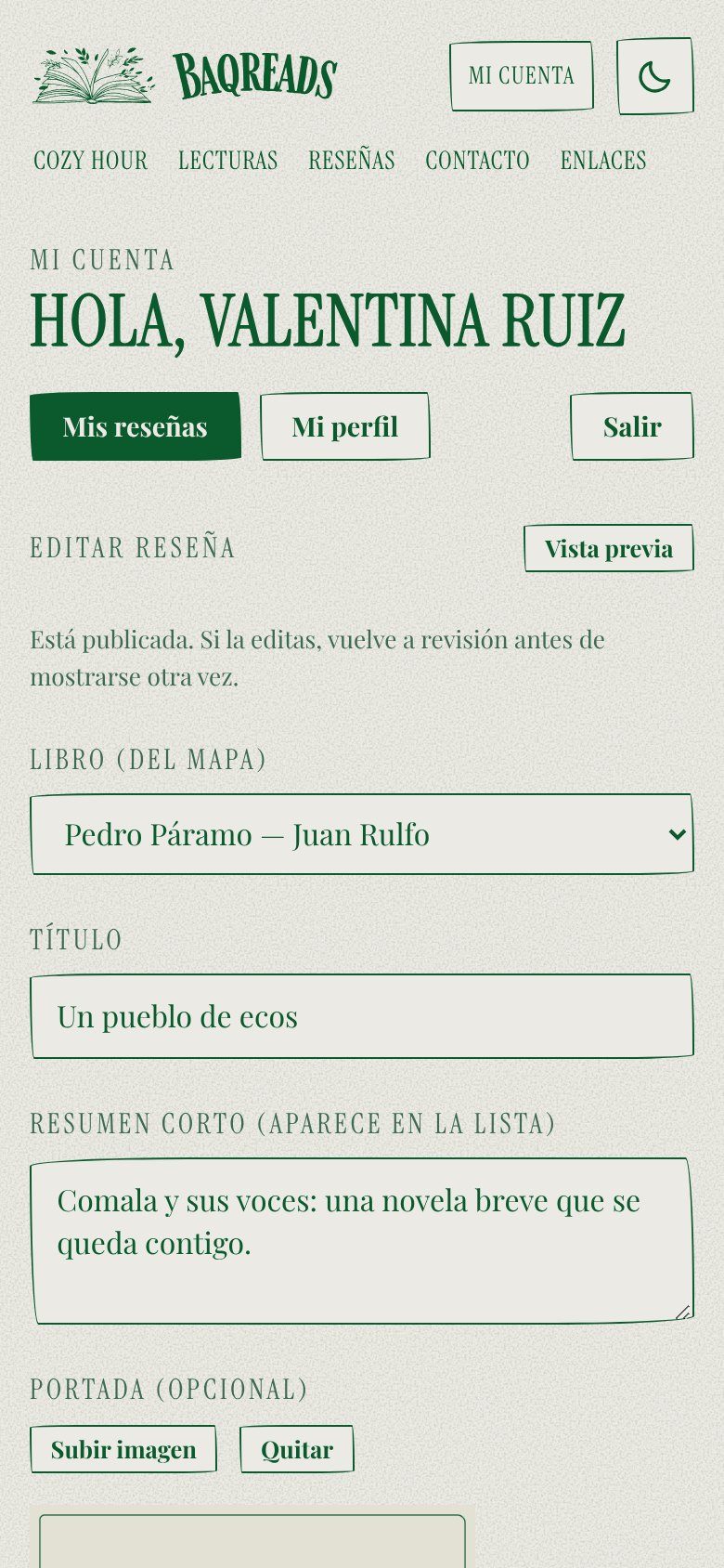
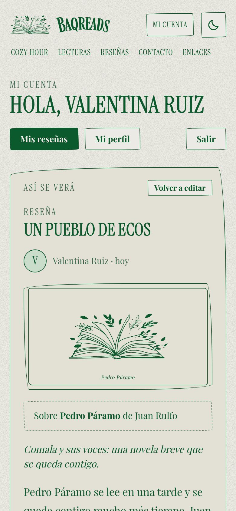
Approving
Reading
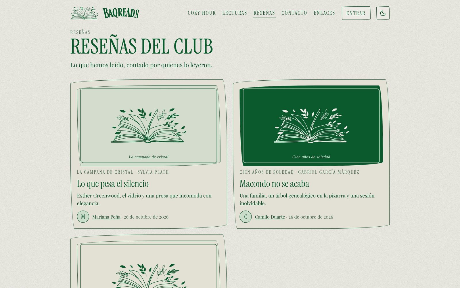
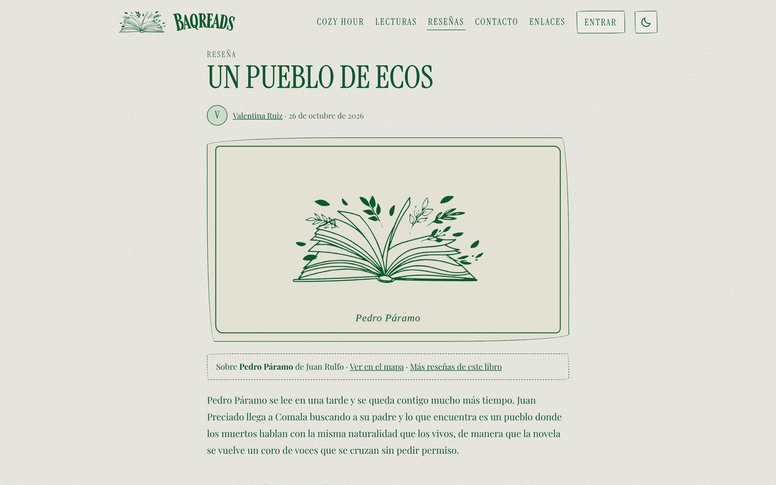
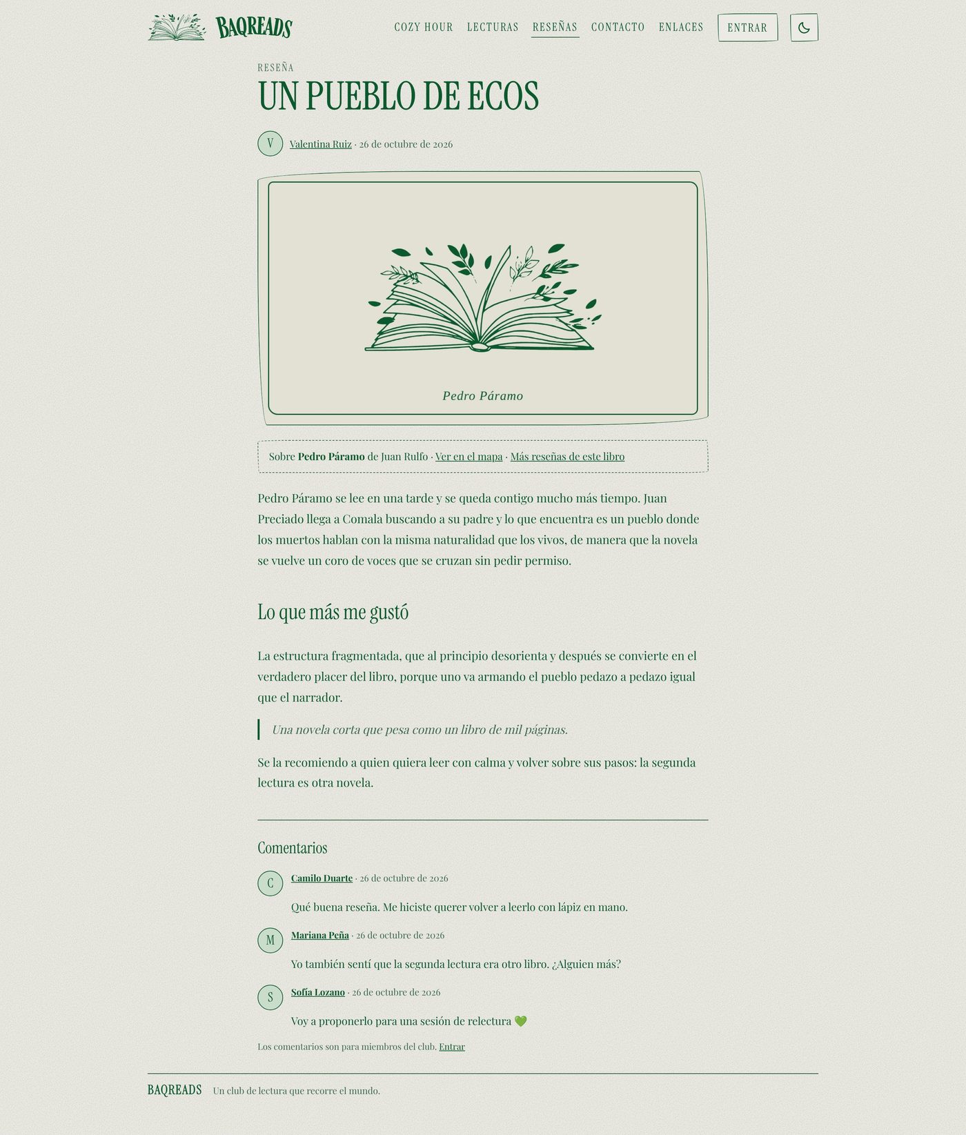
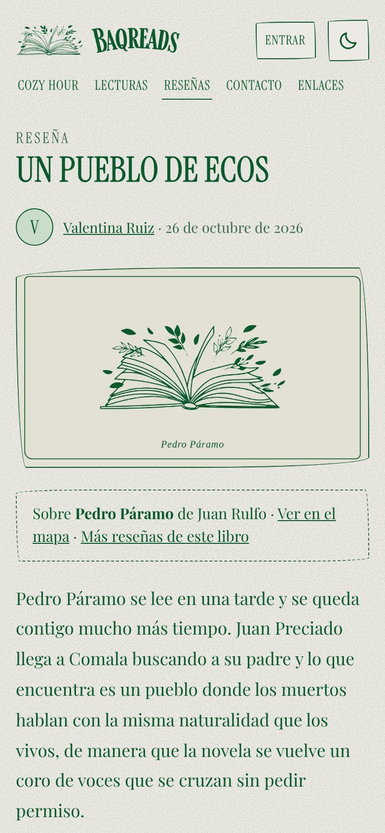
Status. The reviews platform is built and has been tested on a private preview, and it is launching soon. The screens shown here use demo members and demo reviews.
Act 7 of 8
A site the owner can reshape
The owner wanted something like Wix or Squarespace, but only so much, so I built the middle level of freedom, where she can rearrange, add blocks and create pages, with a preview, a publish step and an undo that make it safe to play.
After the reviews, the owner described a different need. She gets ideas late at night, like adding a section to a page or a whole new tab, and she wanted to try them without learning GitHub, “like Wix or Squarespace, but only so much.”
That last phrase became the design brief. I defined three levels of freedom and built the middle one, which gives her real structural control without letting her break the design.
- Edit what exists. Texts, books, links and contact, which was already there.
- Rearrange and add. Reorder or hide the home sections, add blocks anywhere and create new pages that appear in the menu. This is the level I built.
- Design from scratch. Free layout, colors and fonts, which I left out on purpose, because every block already follows the design system and anything she builds looks like Baqreads.
The blocks are a title, text, an image, an image with text, a gallery, a quote, a button, a YouTube or Spotify embed, cards, a green callout and a hand-drawn divider.
Guardrails that make it safe to play
- Live preview. The page being edited is shown in desktop and phone sizes while she works.
- Nothing is public until Publish. Hidden pages never leave the server.
- Version history. Every publish keeps the previous version, and the last 25 can be restored with one click.
- Safe by construction. Links are limited to safe destinations, embeds to YouTube and Spotify, and every block is validated on the server, so a typo or a pasted script cannot break the site.
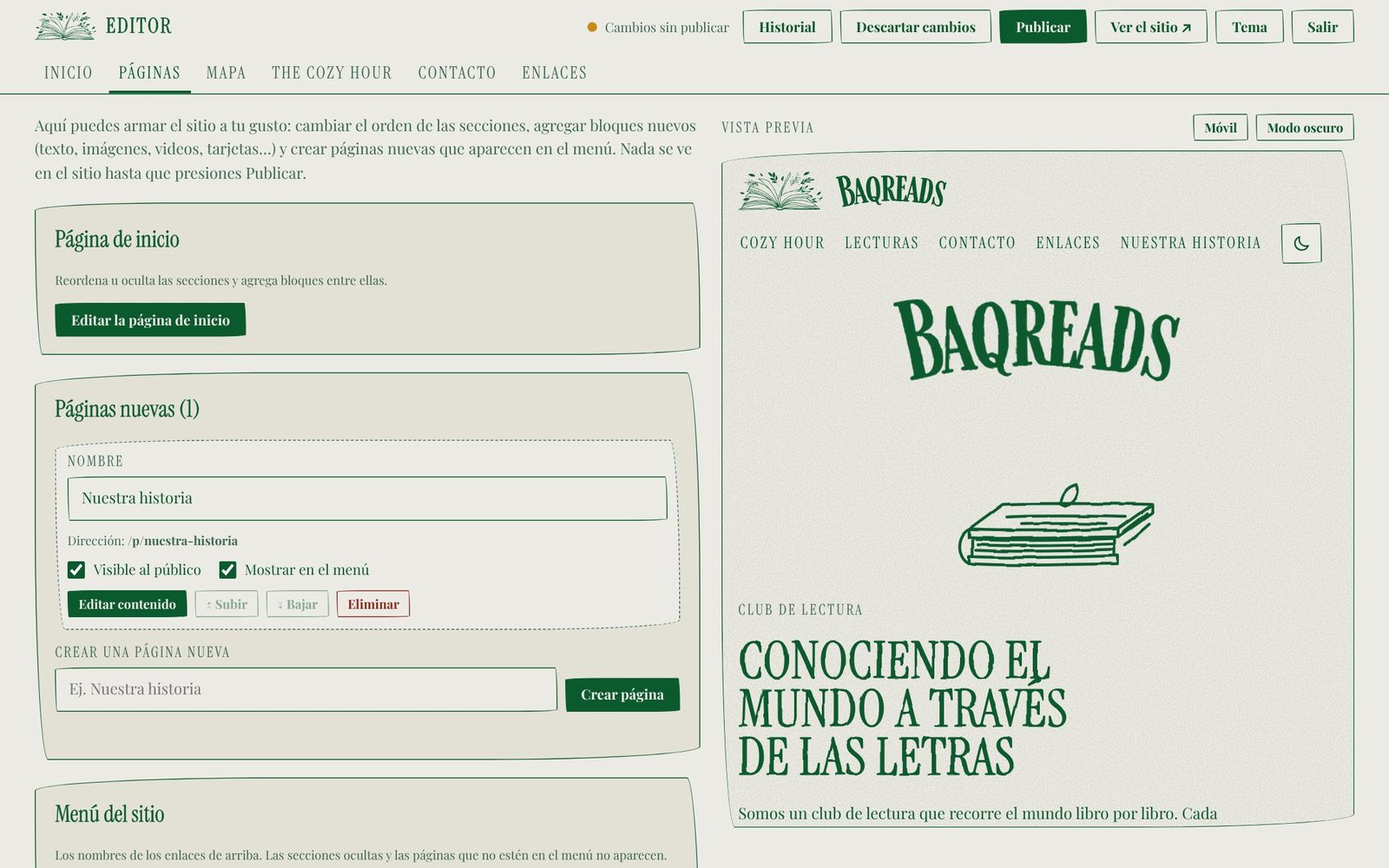
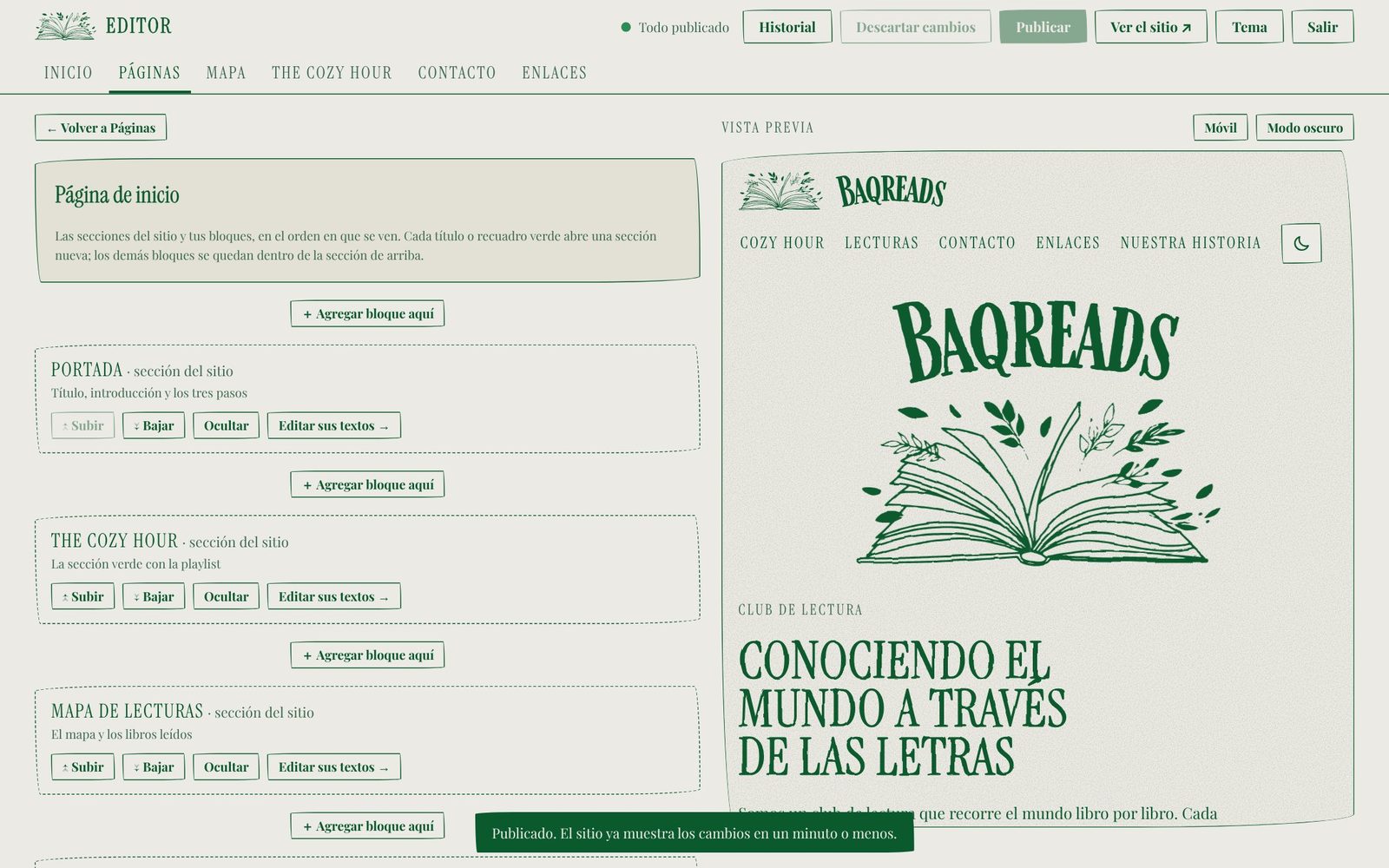
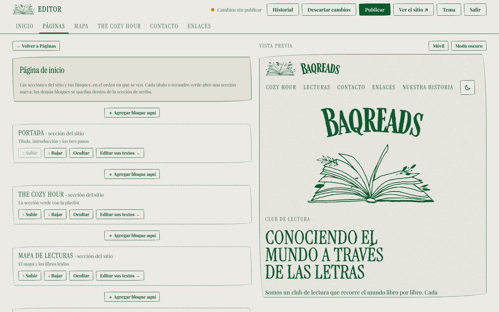
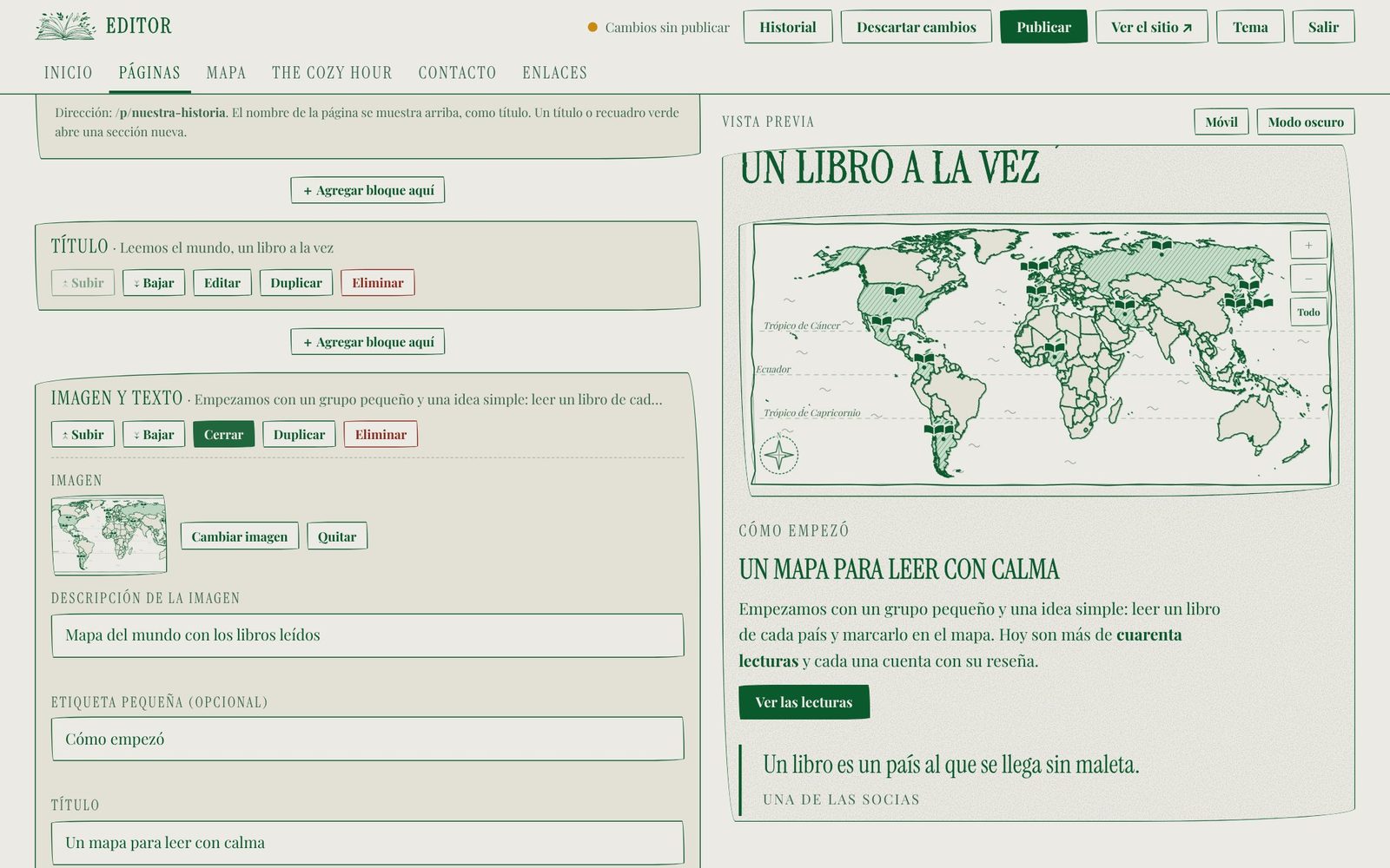
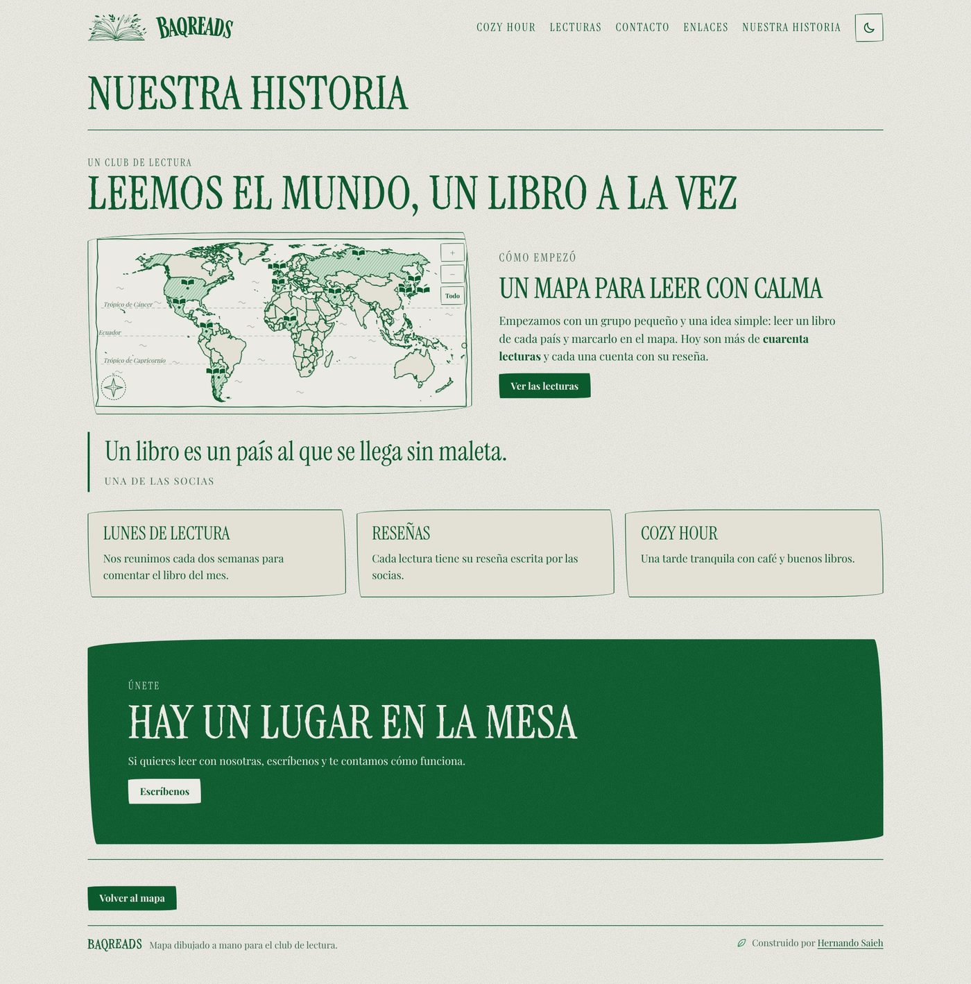

The page shown in these captures is demo content created for testing; it is not a real page of the club’s site.
Act 8 of 8
What changed, and what I learned
The lessons were that constraints are a design material, that a safe place to experiment builds more confidence than any feature, and that the best roadmap came from watching how the club really used the site.
The process in motion
A short recap of the whole process, narrated with on-screen text in Spanish, like the product. It runs 3:29 and needs no audio.
What changed
- The club’s readings, reviews and contact now live in one place instead of four.
- The owner can publish changes on her own, with a preview and an undo.
- The site runs on a handful of managed services without a build step.
What I learned
- Constraints are a design material. Choosing no framework, invitation-only sign-up and a fixed set of blocks made the product simpler, cheaper to keep alive and more consistent than a flexible one would have been.
- Give people a safe place to experiment. Preview, publish and history together did more for the owner’s confidence than any feature, because her fear was breaking something rather than not having enough options.
- Let real needs set the roadmap. Reviews and the page builder were not in the first brief, and both came from watching how the club actually used the site.
Design, UX, UI and front-end by Hernando Saieh, built with the help of Claude Code.
End of the story
Next scene
That was Baqreads. Joynup is up next, or head back to the full list of work.