A case study by Hernando Saieh Diago
A private library app that turns one photo of your bookshelf into a catalog of every book on it.
Still in testing — it may ask for a passcode.
Act 1 of 6
Overview
Cataloging a shelf means typing titles one at a time and reading apps turn your library into a profile, so I set out to build the opposite: point your phone at a shelf, take one photo, and get a private library that knows what you own and where each book sits.
Most readers own more books than they could list from memory. Cataloging a physical shelf means typing titles one at a time, and the apps built for tracking reading are social by default: your library becomes a profile.
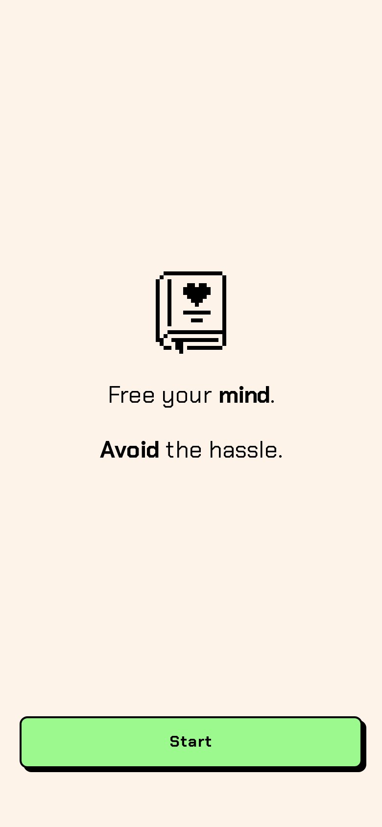
I wanted the opposite. Point your phone at a shelf, take one photo, and get a private library that knows what you own, what you’ve read, what’s next, and exactly where each book sits.
Tomo is a self-initiated project I took from a nearly empty Figma file to a working, installable product: AI spine detection, a design system with light and dark modes, a pixel-art identity, and a brand, built end to end with Claude as my design and engineering partner.
- Product strategy
- UX & UI
- Design system
- Working prototype
- Brand & motion
Act 2 of 6
Testing the riskiest assumption first
The whole idea depended on whether AI could read book spines well enough to be useful, so I built a working prototype early and tested it on real shelves, treating the review step as the product because correcting a match has to be faster than typing it.
The whole idea depends on one question: can AI read book spines well enough to be useful? Thin spines, glare, stylized fonts and books lying sideways all work against it. If detection failed, no amount of interface polish would save the product.
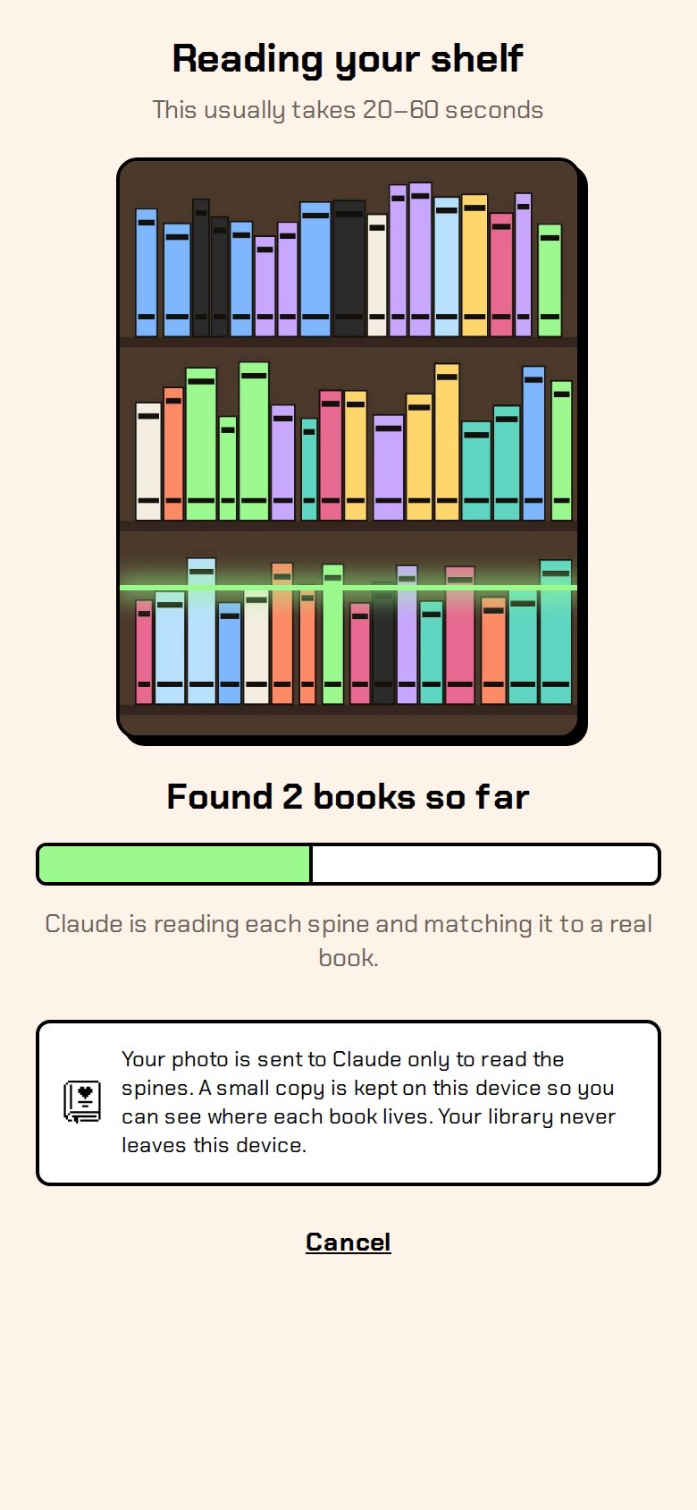
So instead of designing every screen first, I built a working prototype early and tested it on real shelves. A photo goes to Claude’s vision model, which returns each book’s title, author, a confidence score, its shelf row and position, and an approximate outline on the photo.
Detection will never be perfect, so the review step is the product: correcting a match has to be faster than typing it.
That principle shaped everything that followed. It also set the privacy stance early: the photo is used only to read the spines, and the library itself never leaves the phone.
Act 3 of 6
Designing the core flow
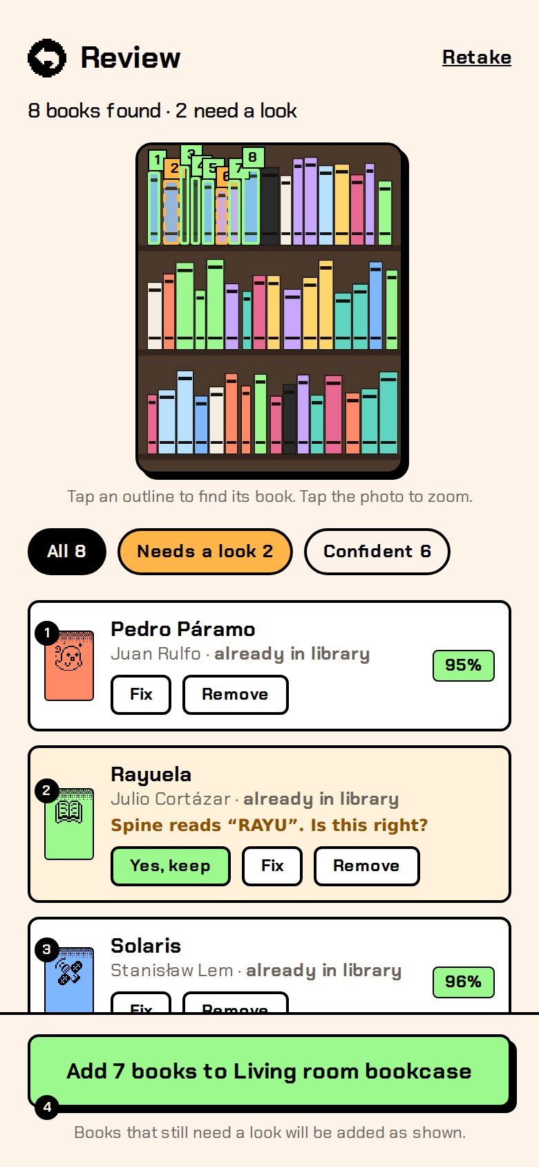
I designed the path from scan to detect to review to library, using confidence scores to be honest about what the AI knows and remembering each book's exact spot on your shelf photo, and then designed the edge states people hit right away.
Confidence as design material
Every detection carries a confidence score, so the review screen can be honest about what it knows. Confident matches show their percentage. Uncertain ones are flagged “needs a look” with Keep, Fix and Remove, and unreadable spines ask to be identified. Tapping an outline on the photo jumps to that book in the list, and vice versa.
Where it lives
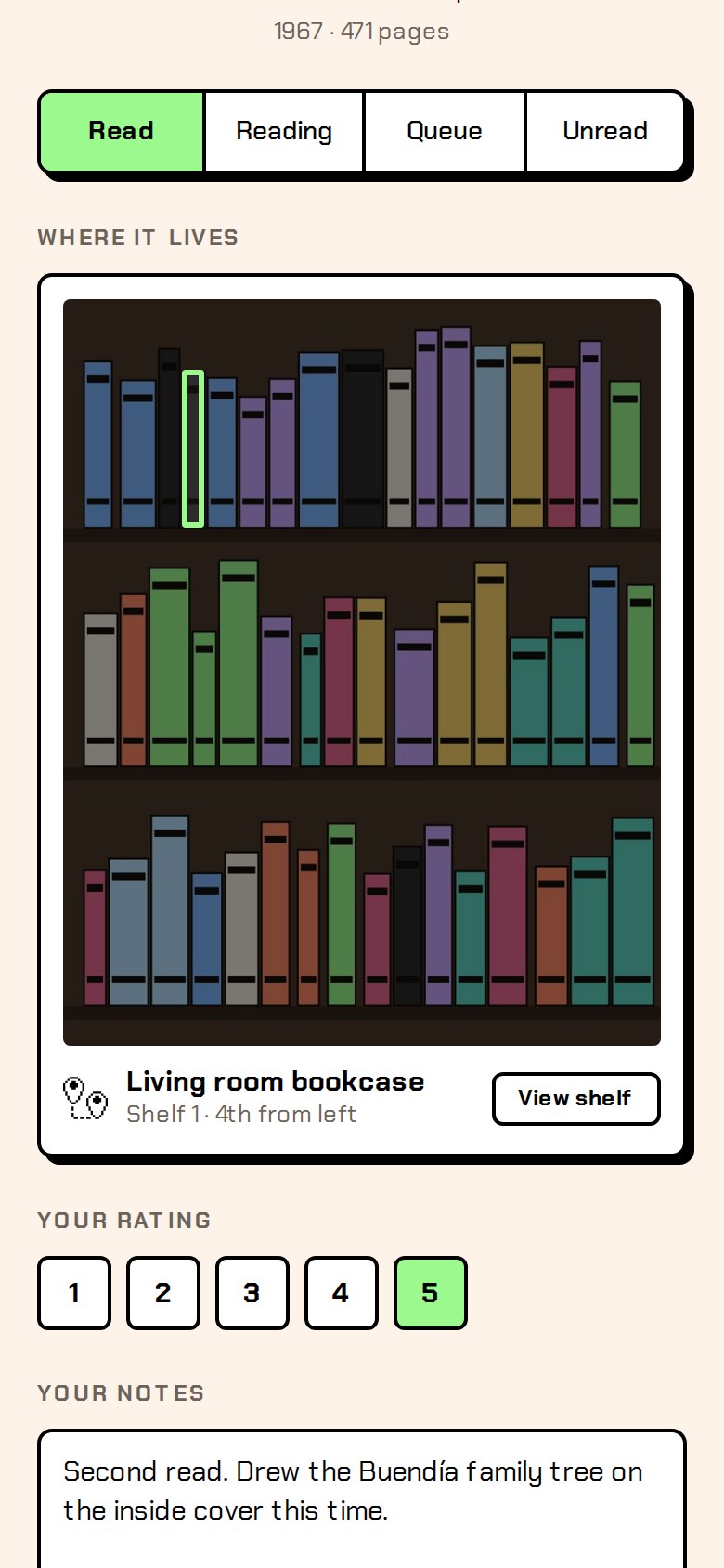
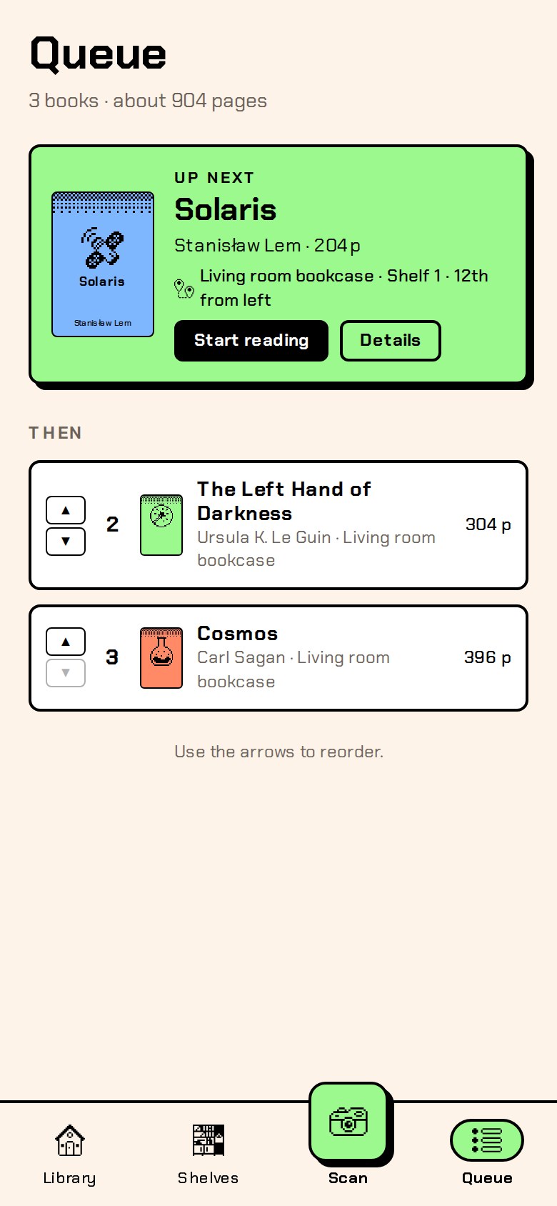
Each book remembers its exact spot, like “Shelf 1 · 4th from left,” and shows it highlighted on your own shelf photo. It’s the detail that makes Tomo more than a reading log: it’s a map of your physical library.
Designing the edges
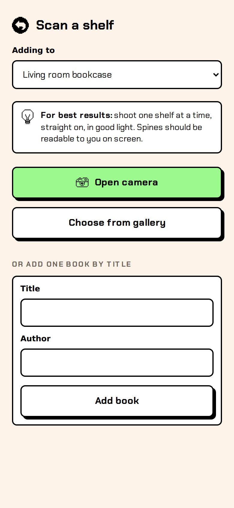
After the main path worked, I designed the states people hit right away: a first-launch empty library, a Fix sheet that searches real editions, a “too few books found” screen with concrete tips, a rescan comparison (new, moved, not seen, with a “lent out” option), and a barcode mode for single books.
Act 4 of 6
Prototyping with real users in mind
The first prototype ran inside Claude, where browsers block the camera, so I turned it into an installable web app, fixed the problems that using it on my own shelves revealed, and made a short tutorial to get it onto phones.
The first prototype ran inside Claude, but browsers there block the camera, so I turned it into a Progressive Web App deployed on Vercel. A small serverless function talks to the AI, which keeps the API key off people’s phones, and a passcode keeps strangers from using it.
Learning from my own use
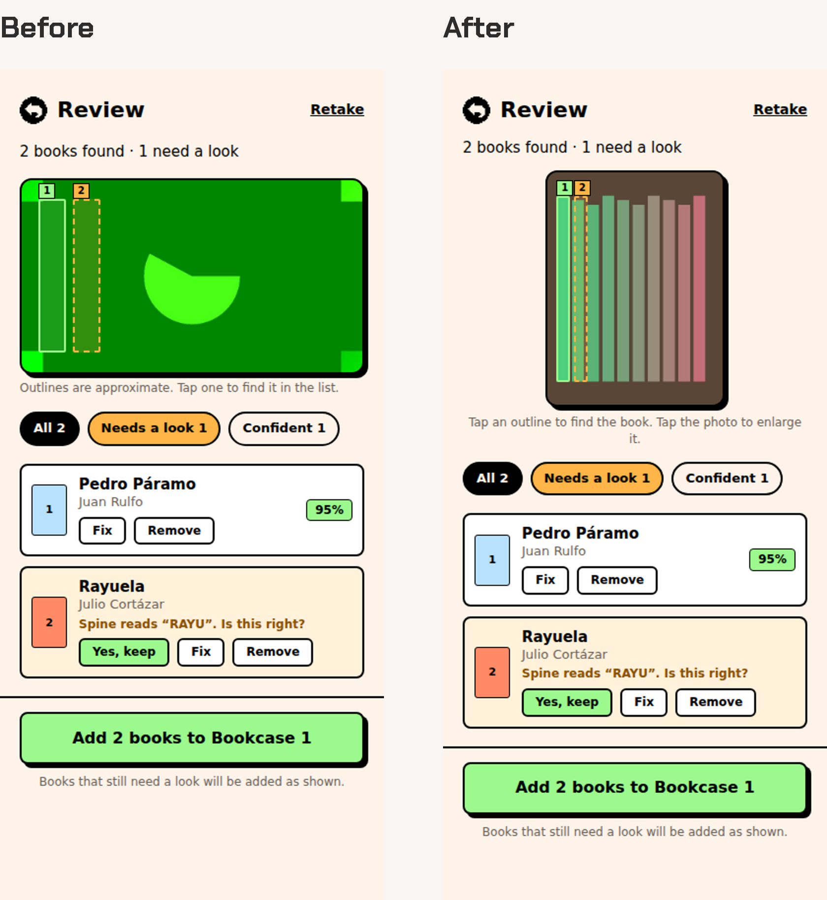
Using it on my own shelves surfaced problems no static mockup would have. While a scan ran, the live counter sat below the fold, so I only discovered it by accident. On the review screen, the tall photo pushed the list of detected books out of view entirely. Capping the photo’s height fixed both, and tapping the photo now enlarges it when you want a closer look.
Getting it onto phones
Installing a web app isn’t obvious to most people, so I made a short Spanish tutorial for iPhone and Android, using a simplified, branded phone that shows only the button that matters at each step.
Act 5 of 6
A system with personality
In Figma I built a design system named to match the app's CSS with a hard offset black shadow as its signature, then gave books without cover art a pixel cover and grew the brand from Bookshelf into an isometric pixel book called Tomo.
A design system built to become code
In Figma I set up variables for color (with light and dark modes), spacing, radius and borders, named to match the app’s CSS, then built the core components on top of them: buttons, chips, status tags, book rows, search, the navigation bar and the book cover. The hard, offset black shadow became the signature detail.
Pixel covers
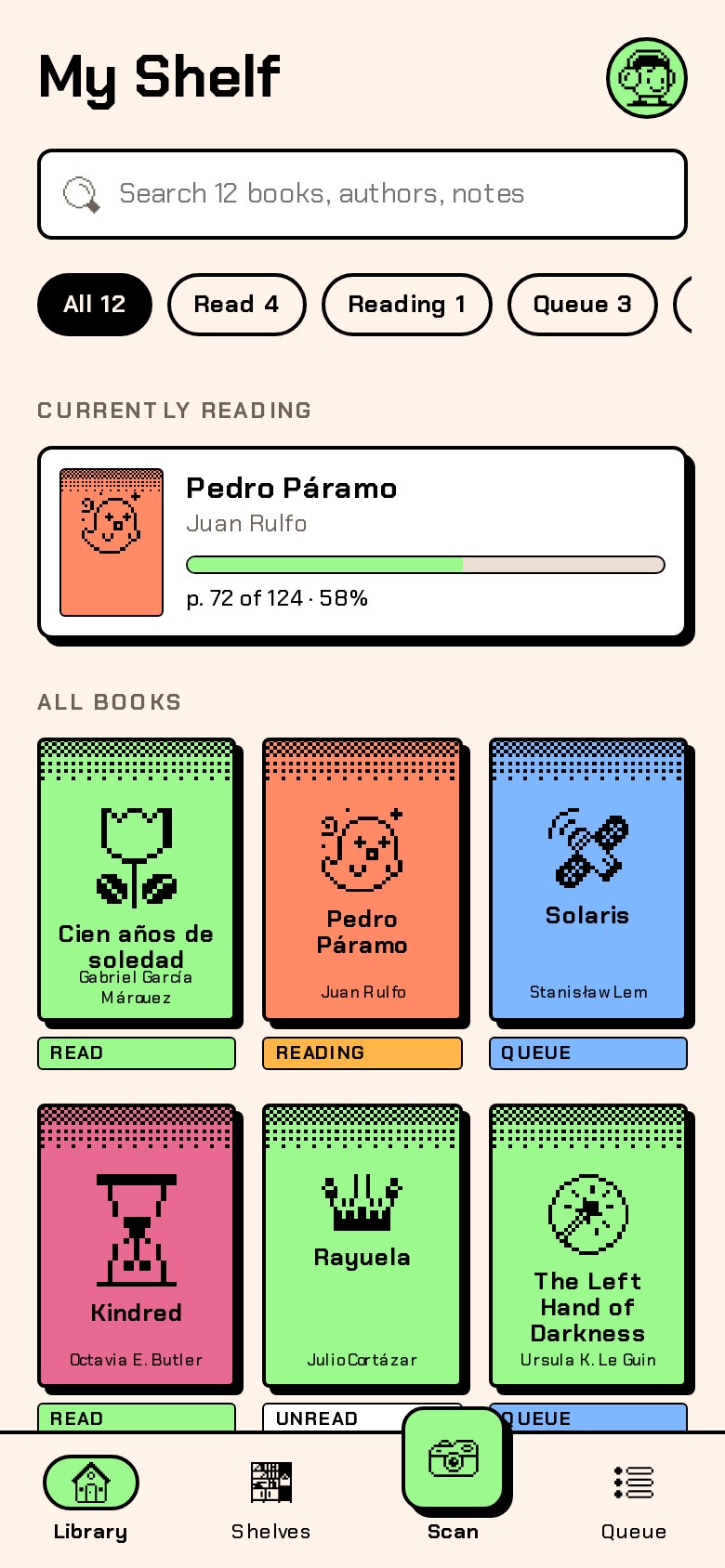
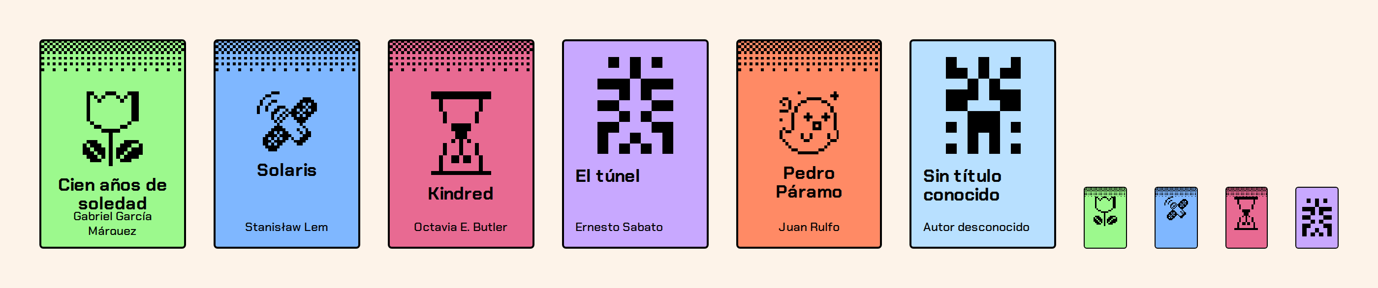
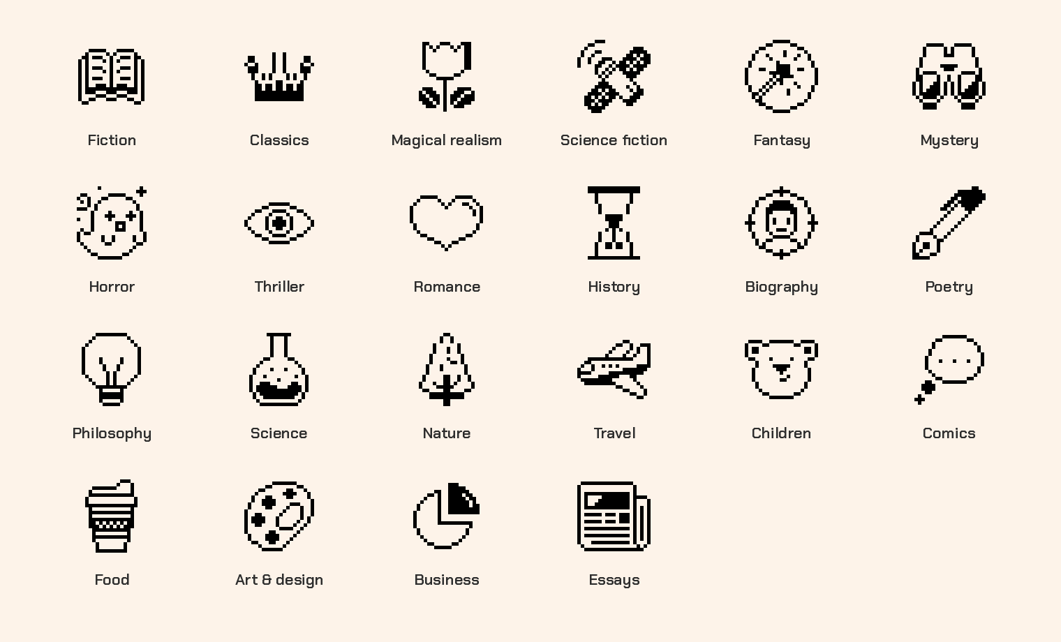
Real cover art comes from Open Library when it exists. When it doesn’t, or when you’re offline, Tomo draws a pixel cover instead of a gray placeholder: an icon for the book’s genre over a dithered band, or, when the genre is unknown, a unique mirrored glyph generated from the title and author. The same book always gets the same cover, on every device.
From Bookshelf to Tomo
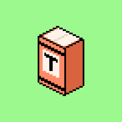
The working name, Bookshelf, described the product but didn’t stand out. “Tomo” means a volume in Spanish, and it’s also “I take,” as in tomo una foto, which is exactly how the app works. For the mark I explored four directions and landed on an isometric pixel book with a T on its spine: an object you’d actually find on a shelf, drawn in the same pixel language as the covers.
Act 6 of 6
What’s next, and what I learned
Tomo is now in testing with a small group, tracking first-guess accuracy, fixes per scan and missed books, and building with AI changed the pace of the project more than its direction because the decisions stayed mine.
Measuring the core idea
Tomo is now in testing with a small group. Rather than vanity numbers, I’m tracking the three things that decide whether the idea works: how many books the AI gets right on the first guess, how many fixes a typical scan needs, and how many books on a shelf a scan misses entirely.
Next is a native app built with Expo, one codebase for Android, iOS and the web, with a proper camera, barcode scanning and an on-device database.
Working with AI as a partner
Building with Claude changed the pace of this project more than its direction. It turned ideas into working code, Figma components and rendered videos in minutes, which meant I could test decisions instead of debating them.
The decisions themselves stayed mine: testing detection before polishing screens, treating the review step as the product, choosing pixel covers over gray placeholders, slowing the onboarding down so it feels calm, splitting the promo into one idea per scene, and pushing the logo from a flat spine to an isometric book. The speed only mattered because I knew what I was trying to learn at each step.
The fastest way to know if an idea is good is to hold a working version of it in your hand.
End of the story
Next scene
That was Tomo. Joynup is up next, or head back to the full list of work.
Would you like to see this as a regular page or to watch the story unfold?
We’ll remember your choice. You can switch any time from the bar at the top.