Just want to see the work? , only the screens and mockups with their captions. Totally optional.
A case study by Hernando Saieh Diago
A website for an independent publisher of forgotten Latin American novels, designed so the team can keep it alive without me.
The site is in Spanish.
Act 1 of 8
Overview
Editorial Ferrocarril is a young publisher that rescues forgotten Latin American novels, and I rebuilt its website on one condition: the people running the press had to be able to keep it alive without me.
Editorial Ferrocarril is a young publisher that rescues forgotten Latin American novels and reissues them in careful editions. Its site was a generic WordPress page that did not reflect the books or the brand, so I rebuilt it, with one condition on my side: the people running the press had to be able to keep it alive without me.
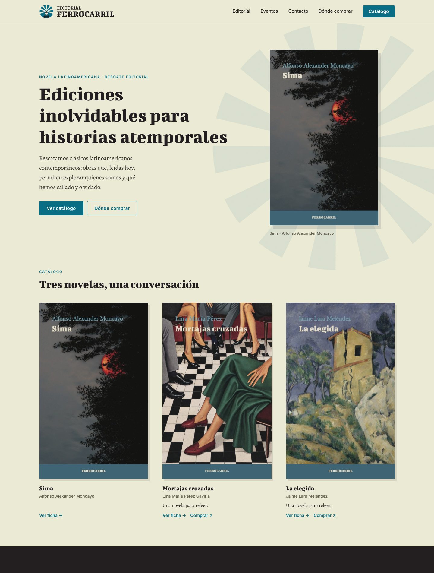
The result is a fast, brand-faithful site with a small admin panel, a book catalog, event pages with add-to-calendar links, a map of where each author comes from and a directory of bookstores that carry the books. The site is in Spanish, so the screens in this case study stay in Spanish and the captions describe them.
- Brand system
- Product design
- Content model
- Admin panel
- Launch
Act 2 of 8
A site that did not carry the books
The old site was a generic WordPress page where the brand was nowhere to be seen, the book pages were nearly empty, the events were a flat list and nobody on the team could change anything without asking a developer.
Ferrocarril had published three titles (Sima, Mortajas cruzadas and La elegida) and was about to start presenting them in bookstores and fairs. They had a brand book, a printed dossier for booksellers and press, and a lot of events coming up, but the website was not doing any of that work.
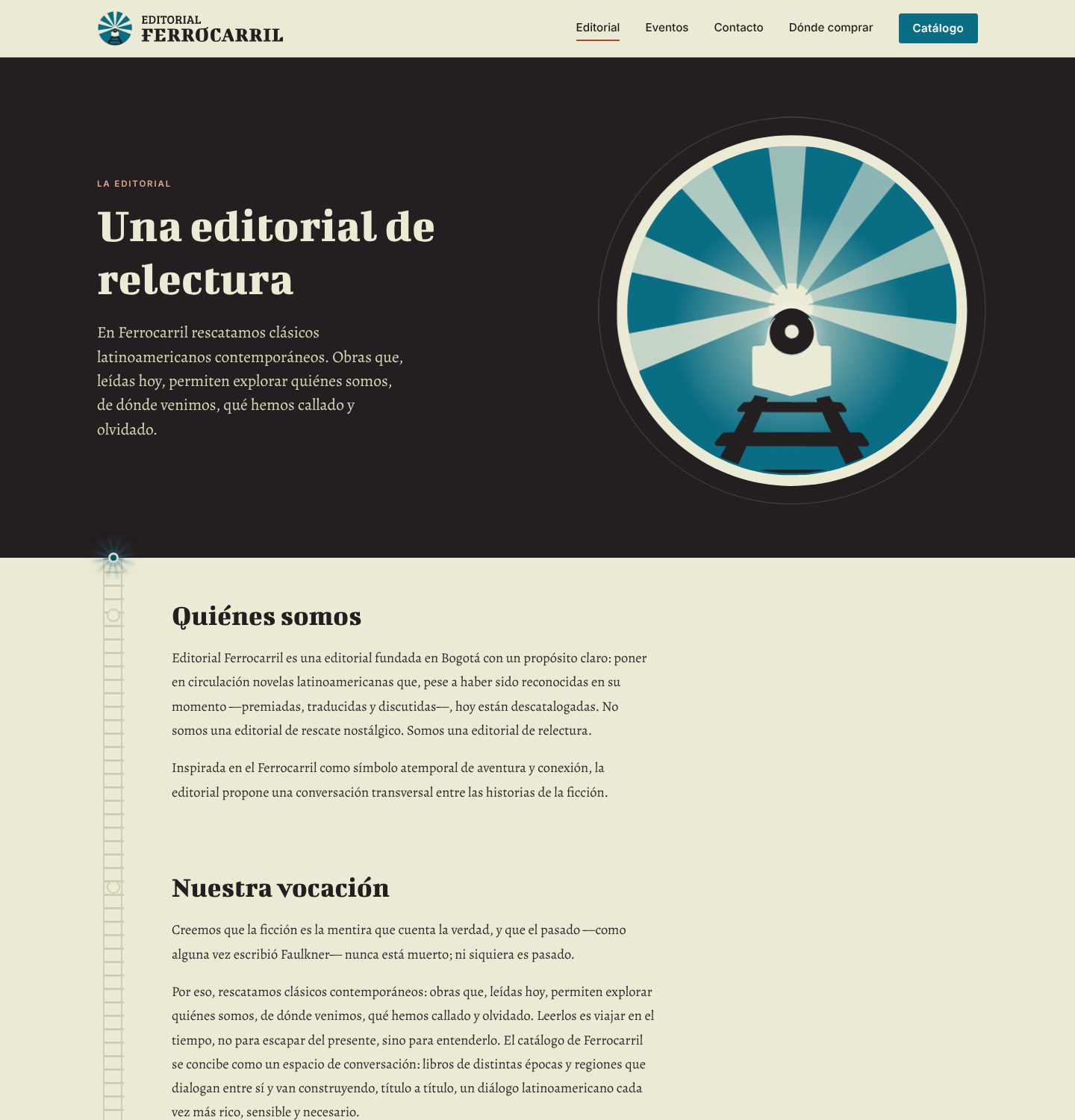
- It did not carry the brand. Typefaces, colors and the train emblem were nowhere to be seen.
- Book pages had almost no information. The reviews, author bios and edition notes lived in a PDF dossier.
- Events were a flat list with no details, so nobody could add them to a calendar.
- Nobody on the team was a developer, so every change meant asking someone.
Goals
- Make the site feel like the books: quiet, literary, confident.
- Put the real editorial content (synopsis, reviews, author, edition, price, ISBN) on each book page.
- Make it easy for readers to find a book and know where to buy it.
- Let a non-technical team edit everything without touching code.
Act 3 of 8
From brand book to web system
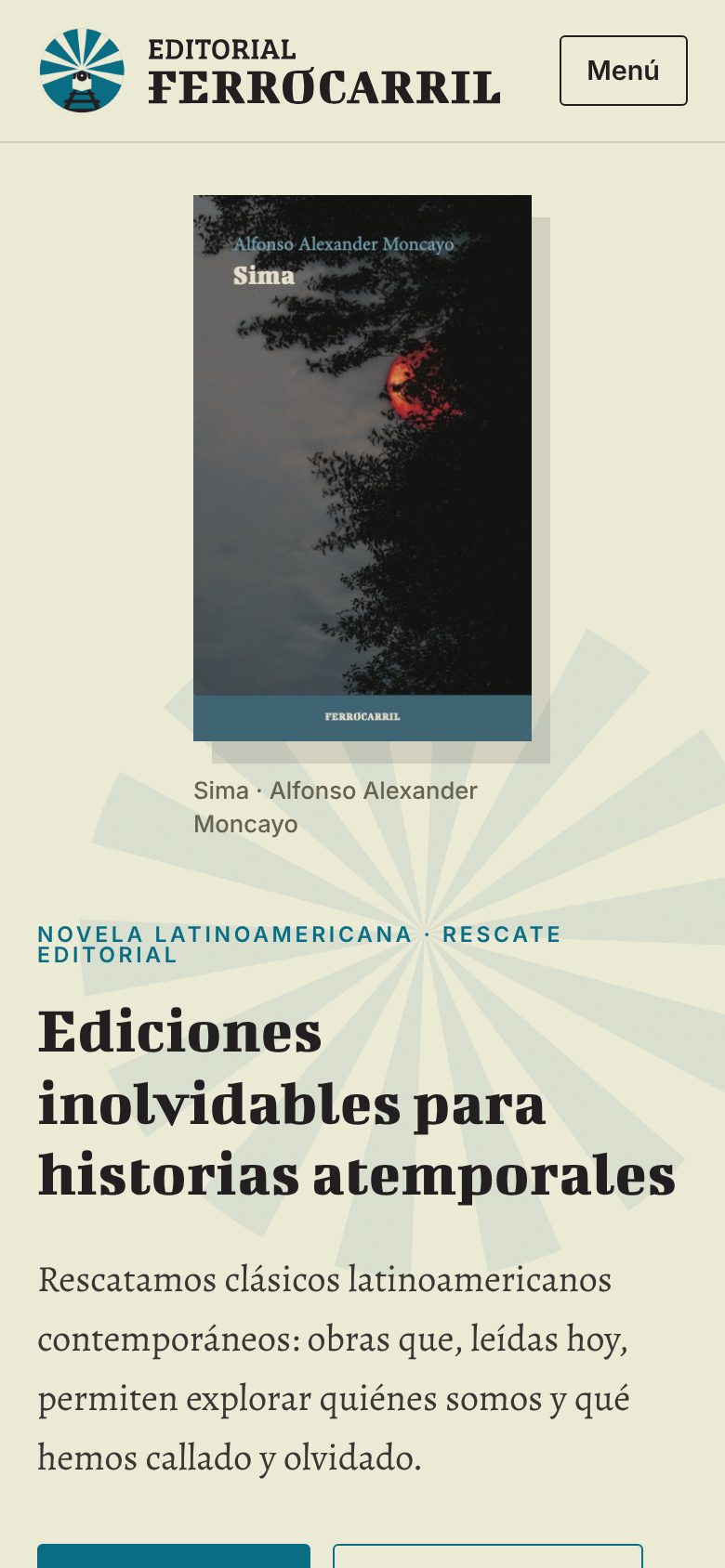
I turned the brand book into a web system with cream paper, near-black ink, teal for actions and rust as a sparing accent, plus two typefaces and a train emblem whose seven light rays became the site's signature.
The brand book gave me four colors, two typefaces (Bigshot One for titles, Alegreya for reading) and a train emblem with seven light rays. I built the interface on those and nothing else: cream paper, near-black ink, teal as the action color and rust as a sparing accent.
The emblem was the hardest asset. The brand book only had raster versions, so for the header and footer I use the original blue variation exactly as designed, and for the logotype I traced vector versions so it stays sharp at any size. A small, honest note for the client: those traced files are a stand-in until they send the official vectors.

Motion with restraint
Headlines rise word by word, covers reveal themselves as you scroll and pages cross-fade. Everything respects reduced-motion preferences. The rule I used was that movement should feel like turning a page, never like a landing page for a startup.
Act 4 of 8
Book pages that do the job of the dossier
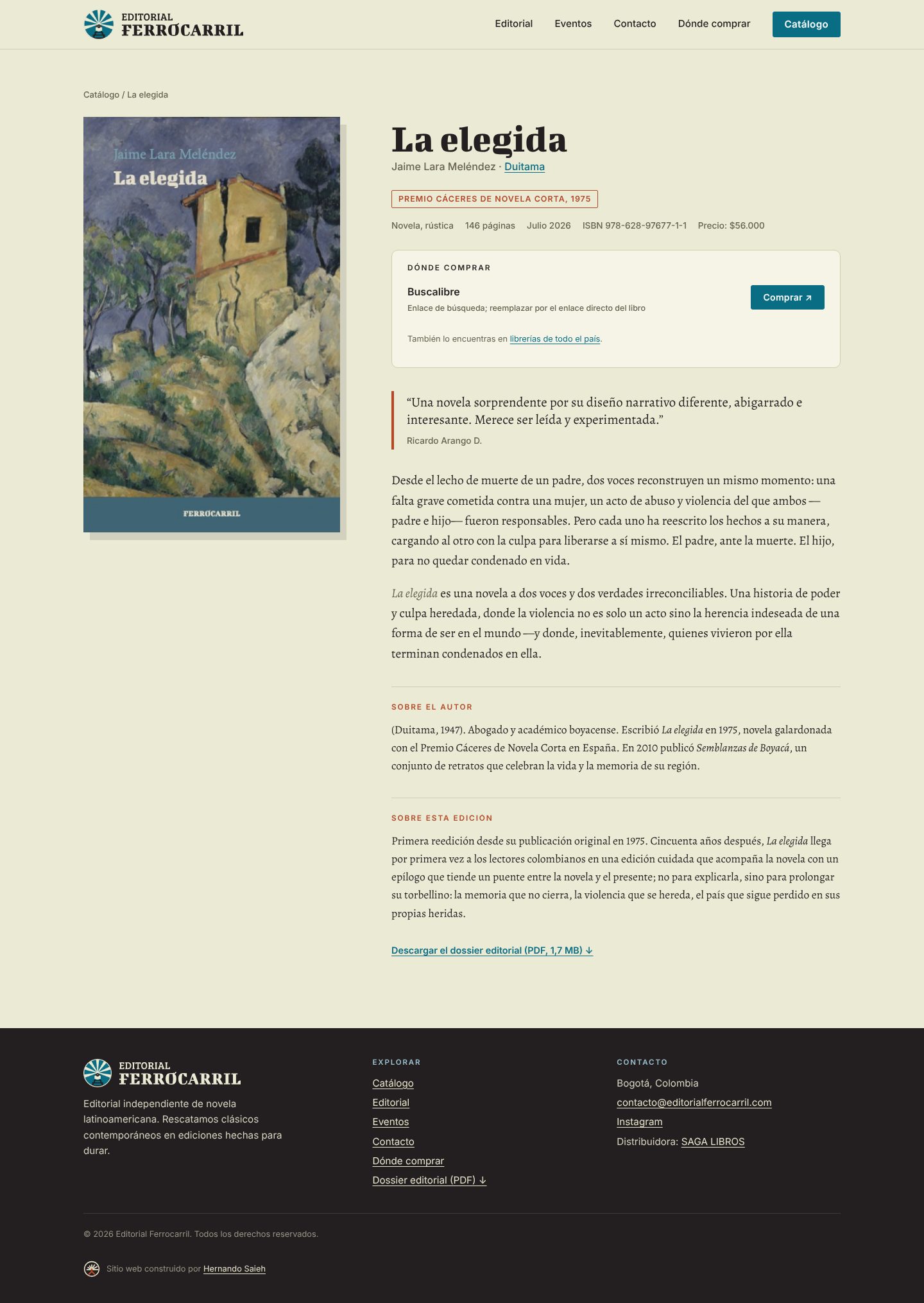
The reviews, the author bios and the edition notes lived in a PDF dossier, so I moved them onto each book page and kept the dossier as a download for booksellers and press.
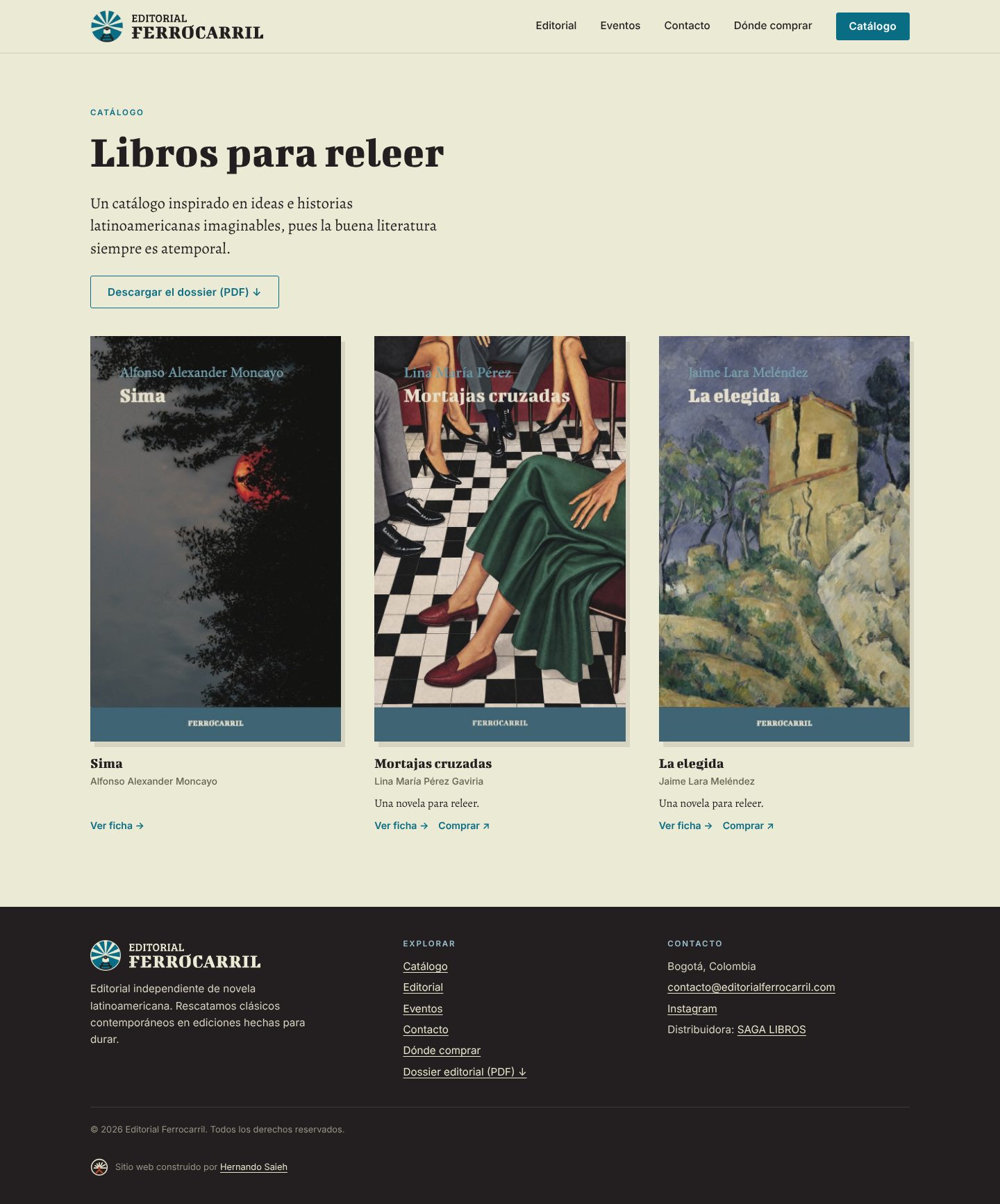
Each book page now carries what a bookseller or a curious reader needs: synopsis, pull quotes from critics, a short bio, notes on the edition, price, ISBN, page count and any award. I moved that content from the PDF into the page and kept the dossier available as a download in the catalog, the contact page and the footer, so librarians and press can still grab it.
Act 5 of 8
A map of where each book comes from
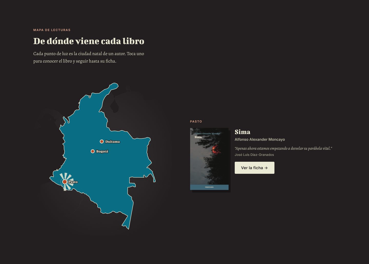
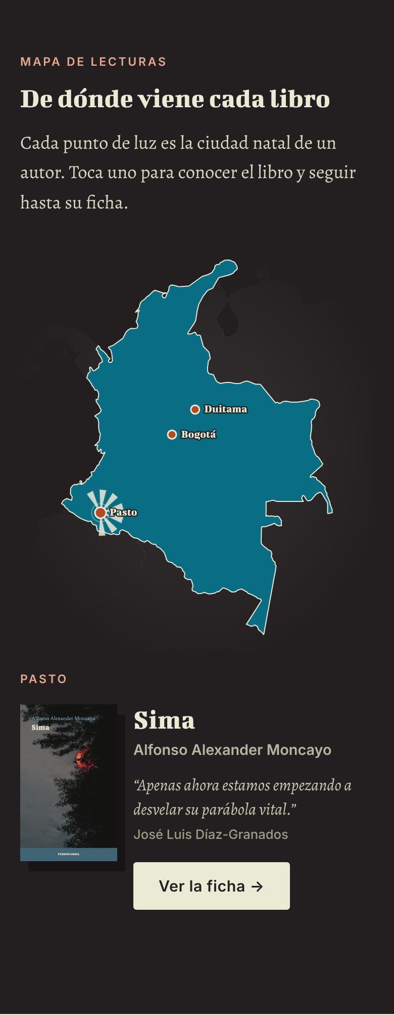
These books are rescues and each one carries a place, so I drew a map of Colombia where every author's hometown is a glowing pin made of the emblem's seven rays, written as inline SVG so it loads instantly.
The idea came from a simple observation: these books are rescues, and each one carries a place. I designed a Colombia map in the brand colors where each author’s hometown is a glowing pin, drawn with the same seven rays as the emblem. Tapping a pin opens the book, a short quote and a link to its page.
I generated the map from open geographic data, simplified it and wrote it as inline SVG so it loads instantly, works on mobile and needs no map library. Each book has a “place of origin” field in the admin, so the map grows as the catalog does.
Act 6 of 8
Events and where to buy
Events became real pages with calendar links in Colombian time, and a messy distributor spreadsheet became a clean directory of bookstores grouped by city that the team can keep editing.
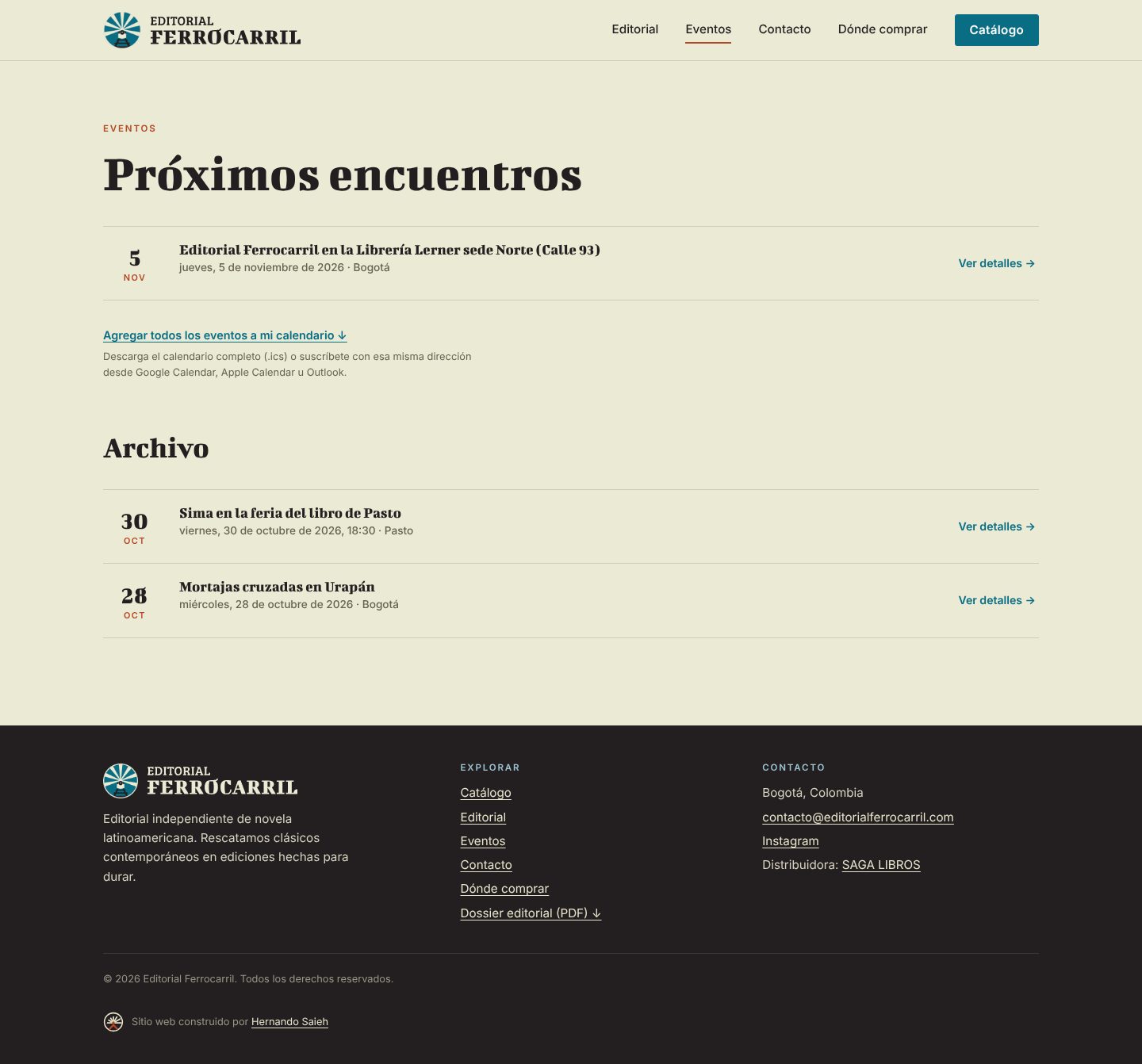
Events people can actually use
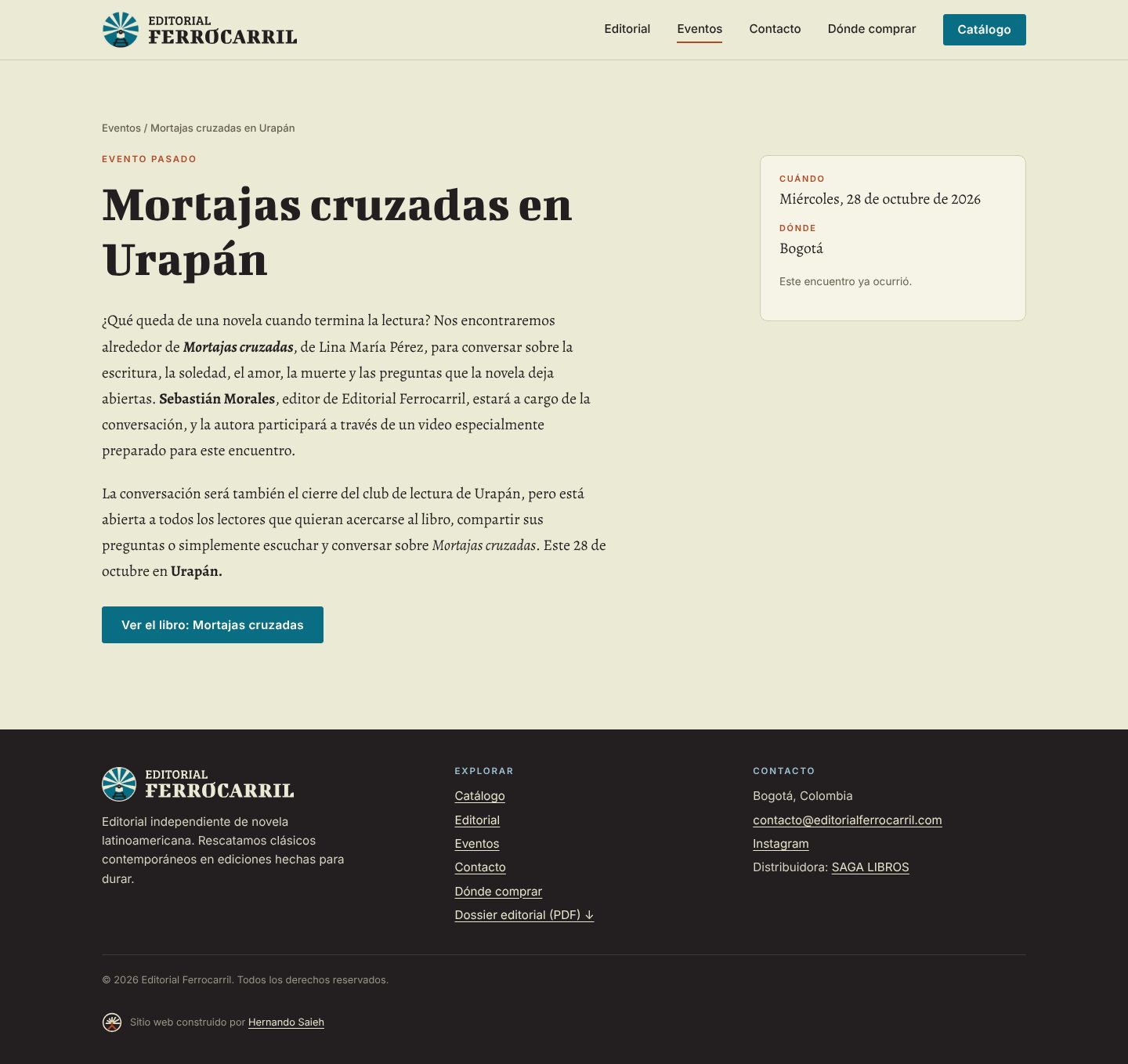
Events became real pages: description, time, address, a related book and a graphic piece uploaded from the admin. Every event has “Add to Google Calendar”, “Add to Outlook” and a downloadable .ics file, plus a feed with all upcoming events. Times are handled in Colombian time so the calendar entry is right wherever the reader is.
Where to buy, organized by city
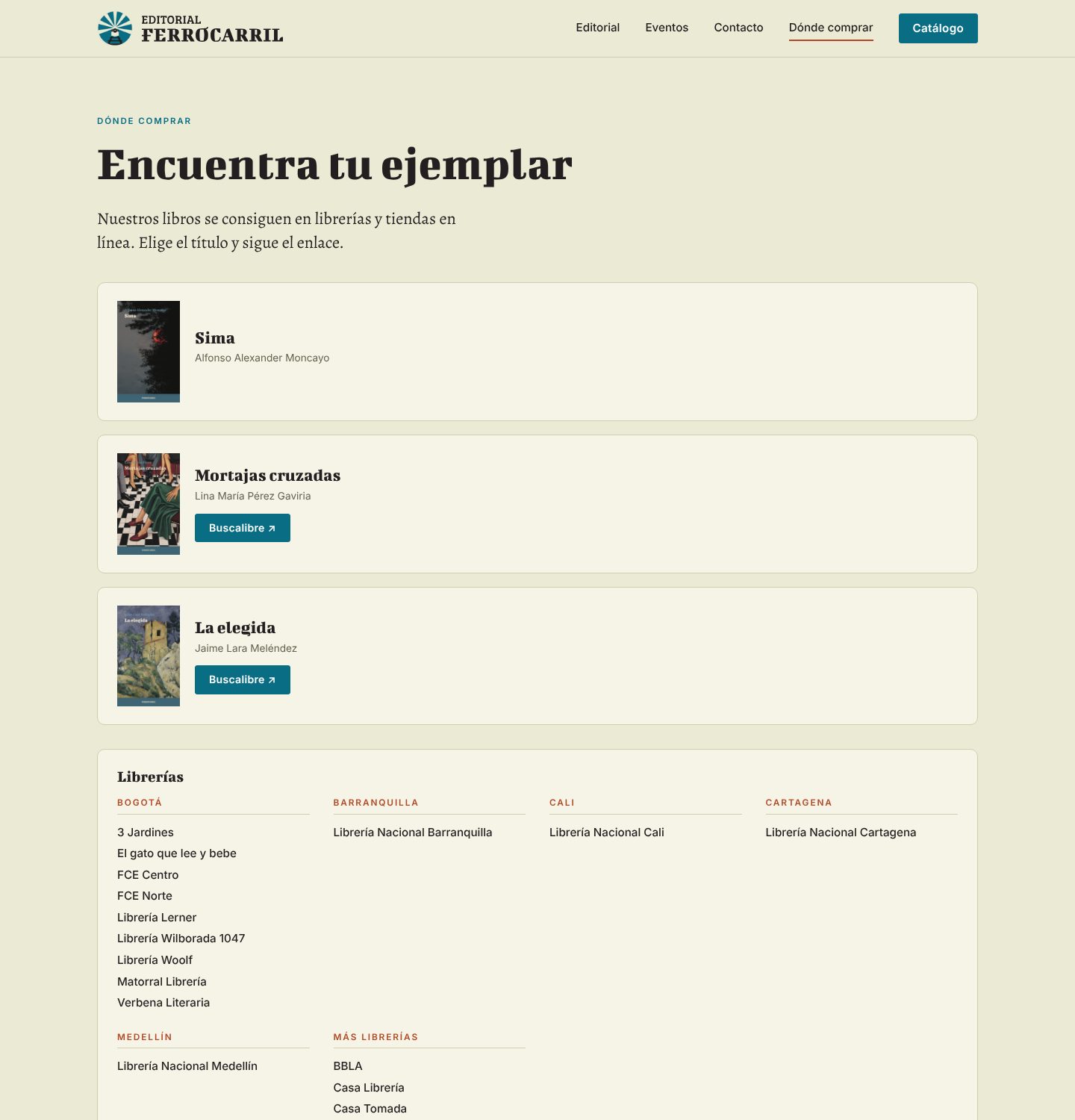
The publisher gave me an inventory spreadsheet from their distributor. It mixed bookstores with warehouses, press copies and book fairs, with company names, tax IDs and stock counts. I cleaned it into a public directory of bookstores grouped by city, without stock numbers, and added a short note that availability varies. The team can add or edit stores from the admin; stores without a city appear at the end until they are placed.
Act 7 of 8
An admin written for the people who use it
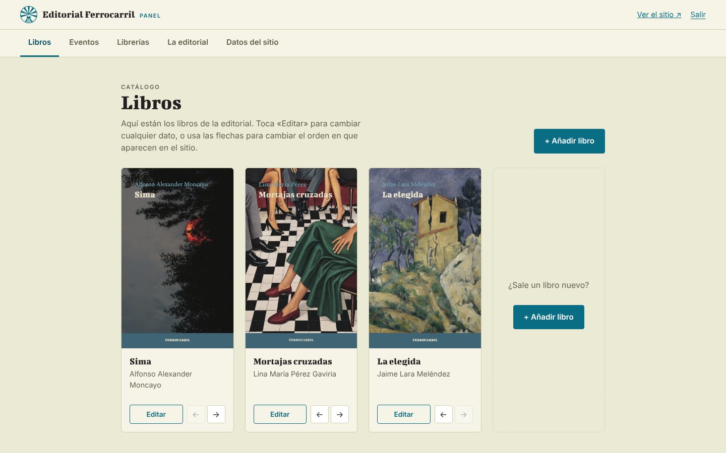
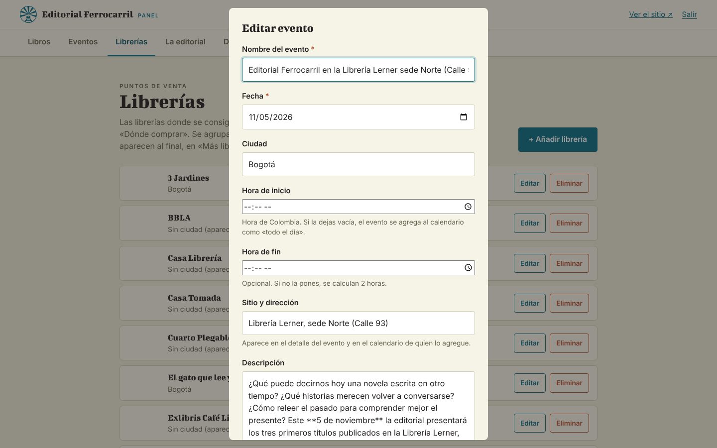
Instead of a generic CMS I wrote a small admin in Spanish, in the brand's tone, with only the fields this team needs, so they can publish a book, an event or a bookstore in minutes.
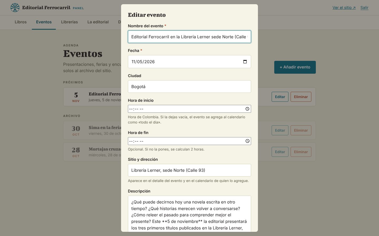
Instead of a generic CMS I wrote a small panel in Spanish, in the brand’s tone, with only the fields this team needs: books, events, bookstores, the editorial text and site data. Images are resized in the browser before upload so nobody has to think about file sizes, and rich text works with a few plain-text conventions (blank line for a paragraph, **bold**, *italic*).
- Fewer fields, in plain language, with safe defaults.
- Images shrink themselves in the browser before they upload.
- Everything the site shows is editable, from a new book to a new bookstore, without asking anyone.
Act 8 of 8
Launch, and what I took from it
I launched it behind a password, moved the DNS, rebuilt the mail records and redirected the old addresses, and what I took away is that a client's content is part of the design and that small, specific details carry a brand.
Launch
Before sharing the site with the client I put it behind a password so it would not look public too early. Then I moved the domain’s DNS to Cloudflare, rebuilt the mail records so the team’s email kept working, connected the apex and www domains (with a permanent redirect from www), and added a sitemap and redirects for common old WordPress addresses.
Outcome
- A complete site in the publisher’s brand, live on its own domain.
- Three books with full editorial pages, a map, a bookstore directory and an events calendar.
- A team that can publish a new event, book or bookstore in minutes without help.
- A site that is fast by construction: server-rendered pages, inline SVG, self-hosted fonts and no heavy libraries.
I do not have traffic or sales numbers yet, since the site had only just launched when I wrote this, so I am not claiming any.
Working with Claude
I used Claude Code as a pair for the build: I set direction, taste and constraints (what the brand should feel like, what the team needs, what to cut), and Claude did the implementation, tested pages in a real browser and caught edge cases like time zones in calendar files and duplicated DNS records. The decisions in this case study are mine; the speed is what the collaboration bought.
What I would do next
- Replace the traced logotype with the official vector files.
- Add real covers at higher resolution and social-sharing images in the brand.
- Fill in the missing cities in the bookstore directory.
- Measure which pages and links readers actually use, then iterate.
What I took from it
- A client’s content is part of the design. The biggest improvement on the book pages was not visual, it was moving the dossier’s real text onto the page.
- Build the admin for the person who will use it. Fewer fields, plain language and safe defaults mattered more than flexibility.
- Small, specific details carry a brand. Seven rays, a train headlight and a hometown pin did more than any decoration would have.
Design and front end by Hernando Saieh, built with the help of Claude Code.
End of the story
Next scene
That was Editorial Ferrocarril. Baqreads is up next, or head back to the full list of work.